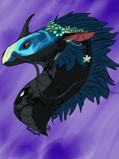
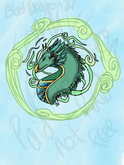
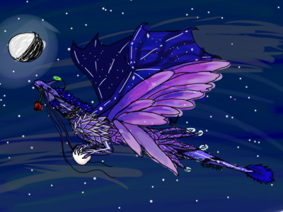
Hi! I'm not very good at art yet but I'm trying to practice and improve. c: If you have and tips/advice for me I'd love to hear it! Specifically I was wondering if you had any tips for drawing smooth/solid lineart and how much you think I could sell art commissions for at my current skill level. Thank you for your time!
Examples:
x
x
x
@Rinstail
Woah! i love your choice of color! Just the right amount of saturation and contrast :D
Your style is also very charming and fresh~ It seems like you already have a good foundation in anatomy, but i would always suggest studying more up on it - especially if you start to branch out. I think it would benefit you to start looking at musculature to get an understanding of what goes on beneath the fur c: Other than that, i would say you should probably stick to flat blocks of color for shading, like you have done in the 2nd example. It looks super good :D. You could also try experimenting with line thickness/weight in your art. Being more deliberate with how and where you place your lines c:
As for prizing - it's a bit hard to say since i don't have any dragon examples here, but i randomly saw your art forum and looked through there!
Based on this example
[img]https://i.imgur.com/hDtj3wg.png[/img]
i would say about 50-60 for starters, and then you can always lower or go higher depending on demand c:
(i would also just love to order some art from you if you decide to open up an artshop! your style is seriously dope :3)
@
Rinstail
Woah! i love your choice of color! Just the right amount of saturation and contrast :D
Your style is also very charming and fresh~ It seems like you already have a good foundation in anatomy, but i would always suggest studying more up on it - especially if you start to branch out. I think it would benefit you to start looking at musculature to get an understanding of what goes on beneath the fur c: Other than that, i would say you should probably stick to flat blocks of color for shading, like you have done in the 2nd example. It looks super good :D. You could also try experimenting with line thickness/weight in your art. Being more deliberate with how and where you place your lines c:
As for prizing - it's a bit hard to say since i don't have any dragon examples here, but i randomly saw your art forum and looked through there!
Based on this example

i would say about 50-60 for starters, and then you can always lower or go higher depending on demand c:
(i would also just love to order some art from you if you decide to open up an artshop! your style is seriously dope :3)
@Rivertyl
I see where you are coming from - the piece is a bit monotone. But i don't necessarily think it is a bad thing ^^ If you want your dragons to stand out more, you could always add more contrast by adding a grapichal element like a thick white outline on the both of them c:
[img]https://i.imgur.com/kLoablA.png[/img]
It would also help them stand out because of the contrast in styles c:
If you want to keep with the painterly style though, i think some color variation could "dampen" the problem :) one method of adding color would be adding some strong rimlight from one direction, perhaps with the complimentary color of blue = orange c:
Hope that helps! :D
@
Rivertyl
I see where you are coming from - the piece is a bit monotone. But i don't necessarily think it is a bad thing ^^ If you want your dragons to stand out more, you could always add more contrast by adding a grapichal element like a thick white outline on the both of them c:

It would also help them stand out because of the contrast in styles c:
If you want to keep with the painterly style though, i think some color variation could "dampen" the problem :) one method of adding color would be adding some strong rimlight from one direction, perhaps with the complimentary color of blue = orange c:
Hope that helps! :D
@
thecakemaster
Don't talk yourself down! your art is very cute :D i can see you becoming a great artist :D
I'm wondering why you're asking me about lineart, when the examples you have shown me are mostly lineless :? i guess the last one has a bit of an outline, so I'll go from there ^^ I don't see any particular problems ^^ your lines are a bit thin, so they're a bit hard to see - you could always try to use a bigger brush size c: other than that, i think you've got a good beginning grasp of what to do :D
I do have some advice for you if you want to work more on your lineless style though :D You need to have darker shadows in order for us to distinguish the form ^^ It is almost impossible to see where the head/chin ends on the fox, because there aren't any clear shadows, same with the foot away from us :) you have made the "arm" away from us a darker color - you should do that with the foot as well ^v^
Other than that, i think you could study animal anatomy a bit (but most likely it'll just come naturally as you improve your art ^^)
(one side note: just making sure - you haven't copied/traced the fox and the gray cat from anywhere right? they just look very different to the pink cat/panther - anatomy wise ^^ tracing is fine in your beginning stages of art - you should just mention it somewhere that it isn't your original piece ^^ Sorry if they are yours! you can ignore this part then c:)
@
cordifolium thanks for the advice! I am secretly a magpie who loves bright colours.
I see what you mean about flat blocks of colour, looks more sleeker/neater, definitely something to work on.
And anatomy!! I'm actually going to be studying this at university! Will be interesting to see how my art improves, very excited
I was thinking about opening an artshop soon, I'll give you a ping when i do it?
@cordifolium
I'm getting back at digital art after a long rest. I don't have full pieces yet, but can you critique these?
edit: oh i posted too many sorry
[img]https://i.ibb.co/qBb6m6P/barbatos-icon-by-catcoffeeisgud-ddfqnh1.png[/img][img]https://i.ibb.co/gRmwwbd/moriori-icon-by-catcoffeeisgud-ddfvqbm.png[/img]
and here's an example of what a full piece can look like (still on the making)
[img]https://i.ibb.co/H41Fcpg/Ankle-god-shading-preview.png[/img]
@
cordifolium
I'm getting back at digital art after a long rest. I don't have full pieces yet, but can you critique these?
edit: oh i posted too many sorry


and here's an example of what a full piece can look like (still on the making)

@
cordifolium
Yes, thank you! Your advice helps a lot ^^
@
cordifolium
Yes, thank you! Your advice helps a lot ^^
@
cordifolium Thank you for your advice! I asked about the lineart because I've been having trouble making lineart that I'm happy with, which is why I ended up dropping lineart all together for now and trying a lineless style. I should've included some examples with lineart, sorry about that! Thank you for the advice on lineart and shading, I will definitely do my best to implement those tips. :) I did not copy or trace the fox and gray cat. They look different anatomy wise because I was using cat references for the fox and cat to get their poses and using a big cat reference for the panther. I'm also still trying to improve on anatomy which is why they look off :,)
@cordifolium
I would love some critique:
Unshaded headshot: [img]https://66.media.tumblr.com/cb46bc1a4642b380ae680d2001c684ea/tumblr_pv4w4sCOkN1yshlpto1_400.png[/img]
Shaded headshot:
[img]https://66.media.tumblr.com/26d6edf7181b10661bc62d2d2d061130/tumblr_pvjmdp2FE11yshlpto1_400.png[/img]
Full body rough:
[img]https://66.media.tumblr.com/c9256ec759fd953ff77e526a7108b26c/tumblr_pvsf5yA1OA1yshlpto1_400.png[/img]
@
cordifolium
I would love some critique:
Unshaded headshot:

Shaded headshot:

Full body rough:

|
|
|

|
-Used to be BlackDragon24-
|

|


