@
Kent
Sweet Stormcatcher, that's incredibly helpful! Thank you.
@
Abderus
I'm glad you like it. I'm personally ecstatic with how well this thread seems to have taken off. Thanks everyone for posting.
Also, have you tried
GIMP? I used it for the longest time and only switched to PS recently. It's a bit difficult, but I still have a soft spot for it. Anything is better than paint.
@
corvidus
I just wanted to mention, I really like your signature banner. 'tis neat.
@
Labcoat
why thank you! :D at some point i'd like to make matching graphics for my skin/accent threads.
can you tell i love the crow motif lol
slight more on-topic, i'm going to throw out a wip for feedback, if anyone wants to take a look.
linking so i don't stretch the thread; it's a pan-themed one for the myths/legends themed contest, and i'll probably rehash it into a greenskeeper entry if it doesn't win (i'm short on time lately, so it's a two-birds-one-stone deal, haha).
mainly i'd like feedback on the bit along the wing. i'm not sure if it's too much at this point - just the legs/head and neck felt a little sparse so i threw something on there but it's kind of directionless at this point. i'm thinking...maybe make it look like ferns? dappled light or moss? or i could scrap it entirely and just add some more ivy hanging down, i'm not sure what would look best.
the ivy itself i'll probably go back and rework because eeeugh i'm not very good at drawing plants, and i'll also probably add in a moss/bark/fur texture here and there for coherence. i'd love to hear any ideas, pointers or crits, if anyone has them!


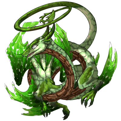
Hi, guys, I wanna ask for a bit of feedback on my first skin (way more work than accents oh boy why did I do this)
[img]http://36.media.tumblr.com/46a5749a33748d6b1f7a9083ff93b691/tumblr_no920rhC1p1u51p6go1_400.png[/img]
Greenskeeper Gathering Entry, gonna post it over there in a bit. The things I'm dissatisfied with are the wings (could have maybe done them differently, but this was the fifth try) and maybe the contrast. But idk how I would have done either of that.
@corvidus hm, I dunno, to me the wings don't seem to quite fit in there, what with the color scheme. Draws the eye too much away from the face? IDK. Also if you feel directionless, Pan is I think associated with reeds and the from that produced pan pipes, so maybe you'll feel inspired to go in that direction?
Hi, guys, I wanna ask for a bit of feedback on my first skin (way more work than accents oh boy why did I do this)

Greenskeeper Gathering Entry, gonna post it over there in a bit. The things I'm dissatisfied with are the wings (could have maybe done them differently, but this was the fifth try) and maybe the contrast. But idk how I would have done either of that.
@
corvidus hm, I dunno, to me the wings don't seem to quite fit in there, what with the color scheme. Draws the eye too much away from the face? IDK. Also if you feel directionless, Pan is I think associated with reeds and the from that produced pan pipes, so maybe you'll feel inspired to go in that direction?
@
Twelvewishes
ah, thanks for your input! the colours will need tweaking anyway, i'd think, but i do suspect the wings might be pulling slightly too far towards the yellows. maybe i'll just add some more ivy there. ivy is good fun
pan is associated with pipes, but since there's already reed pipe apparel i decided not to incorporate that. i might add a belt that lines up with the existing pipes, but it might look too odd on its own.
skins are a surprising amount of work more than accents, aren't they? haha. hmm, i think my biggest suggestion would be to try and work with the pre-existing shadows, rather than against them. you've got bloom on the tail there, but because it's in shadow it sort of "cancels out" and ends up looking kind of muddy. if you're going for a dappled light effect, i think it'd be better to add the highlights "following" the shadow layer, and keep the rest of the body darker for contrast, if that makes sense? i find that a lot when drawing metal - it's a lot easier to keep to the light/dark areas already there and just make the dark areas darker for contrast than trying to force a highlight in the middle of a shadow layer.
this skin from last year's greenskeeper is a good example - it keeps the saturated colours in the highlighted areas, on the face/neck, shoulder and hindleg, with the rest of the body darker to help draw the eye. i think a few tints to the lineart layer could go a long way, too!
the other thing is that the "floating" leaves look slightly odd. maybe add some branches, holding them together? you could also make them darker where they overlap the body, to suggest transparency :)


@
corvidus aaah, thank you! I'll definitely work on it, but for now I won't have access to my computer till next week. I think I'm gonna rework the wings completely and do something with the lighting like you suggested.
Not really sure what to do with the wings though. Oh well, I still have time to think about it.
Love them your guys WIPs! For crit:
@
Corvidus, I agree with Twelve, something more thematic with the wings might work a little better? Tbh, they could be kept plain and I'd still think it'd look good, so there's that.
@
Twelvewishes, same thing, I agree that the wings don't look like they "fit" as well, if that makes sense.
You guys can ignore me though, I've never been good at crit orz.
(Also, live thread, live!)
@
Labcoat
thanks for your feedback! i actually already posted the finished version
here - i'll probably be rehashing it as a greenskeeper entry though, so maybe "finished" isn't the right word for it, haha
@
Labcoat
thanks for your feedback! i actually already posted the finished version
here - i'll probably be rehashing it as a greenskeeper entry though, so maybe "finished" isn't the right word for it, haha
This is very cool! Thanks for adding my guide too. If there's anything I can do to help new skin makers I'll be around too!
This is very cool! Thanks for adding my guide too. If there's anything I can do to help new skin makers I'll be around too!
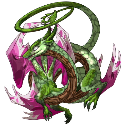
There we go, managed to get around to editing my entry:
[img]https://41.media.tumblr.com/b85c826f39dcece55bde0891ca1b6daf/tumblr_no920rhC1p1u51p6go1_r1_400.png[/img]
I decided to make the wings a more contrasting colr, as well as keep the design rather simple - I felt that the rest of the body was busy enough that it didn't need more stuff to overload it more.
That said, I'm quie excited to make more book accents now that I'm done with this. Any ideas which breed I should tackle next?
There we go, managed to get around to editing my entry:

I decided to make the wings a more contrasting colr, as well as keep the design rather simple - I felt that the rest of the body was busy enough that it didn't need more stuff to overload it more.
That said, I'm quie excited to make more book accents now that I'm done with this. Any ideas which breed I should tackle next?
Don't know if you want this type of resource, but
custom accent previewer code (results in
this)


