Back

Flight Rising Discussion

Discuss everything and anything Flight Rising.
TOPIC | Opinion: My dragons aren't their apparel
1 2 3 4 5
The new update, which I crawled out of my hiatus gutters for, has a lot of amazingly wonderful features. I really love and adore everything except one thing: the apparel boxes. "Clothes make the man", sure - but this is a Dragon site, not a dress-up site. Apparel should NOT be the first thing I see, taking up a third of the screen, for no reason. When I saw a dragon with an awesome outfit, I would then look down to see what they had on. Right now, I'm bombarded with that information first and foremost, even if there's quite literally nothing there. My eyes have to roll over that spot before I even SEE the dragon I've clicked on, and that's an issue for me. The apparel I put on my dragons are an accessory, something to finalize their look, but the apparel is not all my dragons are. I feel like this box needs to go back where it came from, the middle row. Leave my dragon and their familiar (a wonderful change) up top, with their background if they have one, to shine proudly and show off. I'm never showing off apparel I'm wearing - I'm using it to compliment my dragon. Let it take a back seat to my dragon like it should. --- [img]https://i.imgur.com/ehq4bO0.png[/img] I think even removing the "extra" unused squares would be a nice change. I don't want to be "shamed" for going minimalist on my dragons. eta: An example of how I like it looking is seen in my permababy - [url=https://www1.flightrising.com/dragon/50528184][img]https://www1.flightrising.com/rendern/350/505282/50528184_350.png[/img][/url] He's the most important thing on the screen, not the clothes squares.
The new update, which I crawled out of my hiatus gutters for, has a lot of amazingly wonderful features.

I really love and adore everything except one thing: the apparel boxes.

"Clothes make the man", sure - but this is a Dragon site, not a dress-up site. Apparel should NOT be the first thing I see, taking up a third of the screen, for no reason.

When I saw a dragon with an awesome outfit, I would then look down to see what they had on. Right now, I'm bombarded with that information first and foremost, even if there's quite literally nothing there. My eyes have to roll over that spot before I even SEE the dragon I've clicked on, and that's an issue for me.

The apparel I put on my dragons are an accessory, something to finalize their look, but the apparel is not all my dragons are.

I feel like this box needs to go back where it came from, the middle row. Leave my dragon and their familiar (a wonderful change) up top, with their background if they have one, to shine proudly and show off. I'm never showing off apparel I'm wearing - I'm using it to compliment my dragon. Let it take a back seat to my dragon like it should.

---

ehq4bO0.png

I think even removing the "extra" unused squares would be a nice change. I don't want to be "shamed" for going minimalist on my dragons.

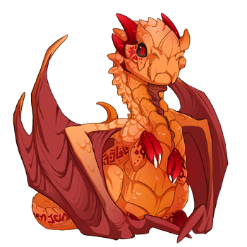
eta: An example of how I like it looking is seen in my permababy -

50528184_350.png

He's the most important thing on the screen, not the clothes squares.
Nq0eoGi.png
Agreed. While I'm not so visually disturbed by the setup, I don't dress up dragons as much. I keep a lot of apparel items in my hoard until I find something that CLICKS. Seeing the empty slots feels, idk... like I should care about that and I'm not. Odd.
[quote]"Clothes make the man", sure - but this is a Dragon site, not a dress-up site.[/quote] I feel like the evidence says something different. It is a dress up site. That is a dragon site, too. It's both, it's definitely both. There's no either/or here. But I also feel like the organization needs to be rethought. I personally don't like the familiar where it is, though, so. *shrug* Different strokes.
Quote:
"Clothes make the man", sure - but this is a Dragon site, not a dress-up site.
I feel like the evidence says something different. It is a dress up site. That is a dragon site, too. It's both, it's definitely both. There's no either/or here.

But I also feel like the organization needs to be rethought. I personally don't like the familiar where it is, though, so. *shrug* Different strokes.
Cheerful Chime Almedha | share project
Fandragons
Lore Starts Here (WIP)
I collect Pulsing Relics!
candle-smol.png ____
47432632.png
I also agree. This sites main draw is the breeding, not the dress up. Putting the clothing up there ruins the aesthetic they were trying for by showcasing the dragons and their familiars. The clothes are super distracting.

I also don’t care much about the apparel the dragon is wearing. I just wanna see a pretty dragon, not a list of shirts.
Hjönk Hjönk Am Goose
Yeah, the apparel placement is really annoying me. I'm not a big fan of the familiar placement either because it makes them look gigantic compared to the dragon, but the apparel first and foremost is just heinous. Instead of "Here's a dragon wearing some clothes" we got "Here's some clothes, oh and also a dragon I guess"

I get that they wanted to center the dragon for the sake of the new Scenes... but the placement of apparel and familiar feels like an afterthought. Like they figured *something* had to go in the empty space so why not.
[quote name="Almedha" date="2020-06-08 09:25:45" ] [quote]"Clothes make the man", sure - but this is a Dragon site, not a dress-up site.[/quote] I feel like the evidence says something different. It is a dress up site. That is a dragon site, too. It's both, it's definitely both. There's no either/or here. But I also feel like the organization needs to be rethought. I personally don't like the familiar where it is, though, so. *shrug* Different strokes. [/quote] Yeah I definitely think it's both? I don't like the empty boxes where things aren't though
Almedha wrote on 2020-06-08 09:25:45:
Quote:
"Clothes make the man", sure - but this is a Dragon site, not a dress-up site.
I feel like the evidence says something different. It is a dress up site. That is a dragon site, too. It's both, it's definitely both. There's no either/or here.

But I also feel like the organization needs to be rethought. I personally don't like the familiar where it is, though, so. *shrug* Different strokes.
Yeah I definitely think it's both? I don't like the empty boxes where things aren't though
Professional Grump

I live for memes
i'd rather much prefer the space around the dragon to be empty than to be cluttered with the apparel and a gigantic looking familiar
DmRdZYl.png
Hard agree, It's the most jarring thing to have the apperel here

the empty boxes under the used ones are also incredibly useless and just plain wrong, especially since even the ones I haven't unlocked yet are visible.

I love how permababies and ancient profiles look much more because of this
Hard agree, It's the most jarring thing to have the apperel here

the empty boxes under the used ones are also incredibly useless and just plain wrong, especially since even the ones I haven't unlocked yet are visible.

I love how permababies and ancient profiles look much more because of this
BLACK LIVES MATTER

thisaddefinitelydoesntminebitcoin.gif
I hear ya. Personally, I think the dragon's physical characteristics are more important than the apparel, but the genes and colors are now hidden beneath the fold of the page.

I just now noticed that the physical info on other players' dragons is up higher, so at least if I'm looking to buy dragons for breeding projects I won't have to scroll down for those.
I think even something basic as removing the extra empty boxes would go a long way to fixing a lot of the "clutter" look that's going on right now.
Nq0eoGi.png
1 2 3 4 5