Back

Creative Corner

Share your own art and stories, or ask for critique.
TOPIC | i'll critique your art! (rules upd8)
1 2 ... 76 77 78 79 80 ... 86 87
@Spooner hello hello! let's see what we can crank out of the old advice machine. hands are haaard and i'm still getting to grips (lol) with them myself, but i can for sure share some tips! the biggest thing for me was learning to forget about the structure and start by just drawing the overall gesture. hands have lots of fiddly bits and joints and so on, and if you try and approach them by drawing one finger at a time it's just a nightmare (with such issues as running out of space for the fifth finger, as you've experienced). instead, it's best to start by portioning out the real estate for your fingers first, and then filling it in. when i'm sketching, either from imagination or doing a study, i try to think about the 'envelope' of the hand first: [img]https://64.media.tumblr.com/8ae89de7d3f99ecaa16824788a6ec559/3e56e8beb9a5d86a-a7/s1280x1920/18b69864a9c4ecf1261d909037c77fa9862394c9.png[/img] [img]https://64.media.tumblr.com/41ea829cabc2b231cebe392b4c4e6185/3e56e8beb9a5d86a-80/s1280x1920/a88da984615b50a9d9461319a3920c09d60d80d6.png[/img] photos from [url=https://www.deviantart.com/adorkastock/art/50-Hand-Challenge-Pack-244-Hand-References-348847368]AdorkaStock's 50 hand challenge pack[/url]. the other part to this, of course, is refs and a lot of practice haha. but imo refs are mainly useful for once you're building in structure and fine details; if you can internalise the rough envelope shape then you should find the basic shapes of the hand to be much more agreeable. on to the second part - ooh, yeah, i get what you mean! for rigging in Flash, right? (i think Flash is actually called something else these days, but i digress.) so, there are kind of two angles to this! one is the style concerns - how best to simplify this hand shape, in a way that looks appealing? but there's also a mechanical concern - how best to put these hands together for functional puppetry? let's take a crack at the first one, because even that's pretty tricky... [img]https://64.media.tumblr.com/fa06a429224b33bc8c56e8613c66cbd4/3e56e8beb9a5d86a-a1/s1280x1920/85f1f78c9bcb0998fa690633b78b2959b692f760.png[/img] ultimately, finding an appealing way to stylise and simplify something is really tough. even the sketches at the bottom here were way trickier than i thought they'd be! my gut feeling would probably be to go with a human-ish cartoon hand and just tweak the proportions slightly - add claws, exaggerate the third and fourth fingers, and you're good to go. (if you're not married to anatomical accuracy, you could even go for a three-fingered design, and exaggerate the middle finger - ah, although now that i've written that, i can immediately think of a reason you should actually Maybe Not. but the three-fingered hands in cartoons serve a strong purpose - it leads to a clearer gesture, and honestly it's also a lot easier to draw.) as for the second prong, here, the mechanical design constraints really hinge on what you want the character to be doing and how you want them to be able to emote. i'm not an expert on making cartoons in flash by any means! but i'm pretty sure that the usual approach is to avoid rigging the hand as much as possible, and instead just have a couple of different hand poses/symbols (and switch to a closeup hand puppet for detail shots). if i was doing something similar i'd have one bone in the hand max, and 'animate' it by deforming via squash and stretch. after that it just becomes a question of, what do you want the hands to be doing? i think you could get a lot of mileage out of just one [url=https://i.pinimg.com/originals/eb/df/e5/ebdfe5bef8184e9a7cf06689aae3bec4.jpg]relaxed pose[/url] at a 3/4 view and one extra, maybe waving? if you want the character to pick up a coffee cup, is it really better to try and contort a hand rig around a cup handle, or would it just be easier to draw a new hand-holding-coffee symbol and switch it out when needed? 2D 'puppets' are kind of a midpoint between frame-by-frame 2D animation (where you need a new drawing every frame if you want to move things) and 3D animation (where animation is made almost entirely by moving and contorting a model). because of that, i think you always have to be conscious of which approach will be easier to do a different thing - treating it like a puppet, or treating it like a drawing? and which side a given action will fall on depends on the action, and also the complexity of the puppet; i think you might have more leeway to contort a simpler 3-fingered puppet, whereas for a four-fingered hand it's harder to pull off without it looking a bit weird. all this is just my musings, though! i dunno how useful this actually is to put into practice, i've never done anything like it myself - i don't have any qualifications other than 'amateur cartoon liker', haha. i think the other thing i'd suggest is watching flash cartoons and seeing if you can figure out how they're made. try and reverse-engineer how their characters are rigged, and look out for the 'cheats' they use to animate tricky parts, like hands! i'll wrap up here because this has been equally text-wall-y, but i hope it helps!
@Spooner
hello hello! let's see what we can crank out of the old advice machine.

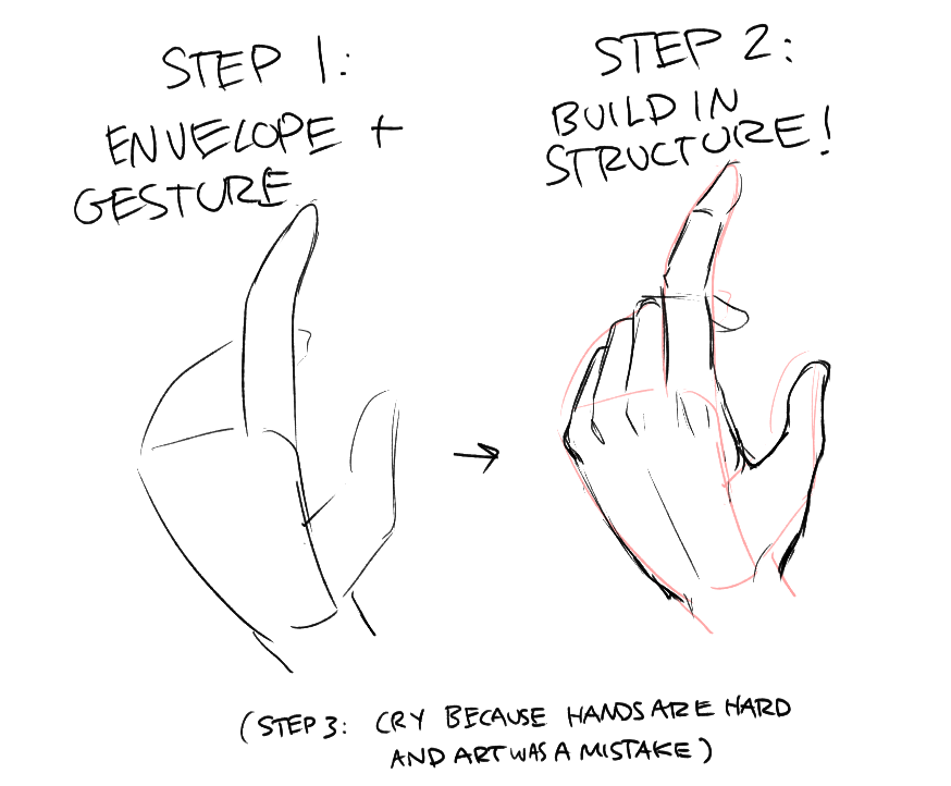
hands are haaard and i'm still getting to grips (lol) with them myself, but i can for sure share some tips! the biggest thing for me was learning to forget about the structure and start by just drawing the overall gesture. hands have lots of fiddly bits and joints and so on, and if you try and approach them by drawing one finger at a time it's just a nightmare (with such issues as running out of space for the fifth finger, as you've experienced). instead, it's best to start by portioning out the real estate for your fingers first, and then filling it in. when i'm sketching, either from imagination or doing a study, i try to think about the 'envelope' of the hand first:
18b69864a9c4ecf1261d909037c77fa9862394c9.png
a88da984615b50a9d9461319a3920c09d60d80d6.png

photos from AdorkaStock's 50 hand challenge pack. the other part to this, of course, is refs and a lot of practice haha. but imo refs are mainly useful for once you're building in structure and fine details; if you can internalise the rough envelope shape then you should find the basic shapes of the hand to be much more agreeable.

on to the second part - ooh, yeah, i get what you mean! for rigging in Flash, right? (i think Flash is actually called something else these days, but i digress.) so, there are kind of two angles to this! one is the style concerns - how best to simplify this hand shape, in a way that looks appealing? but there's also a mechanical concern - how best to put these hands together for functional puppetry?

let's take a crack at the first one, because even that's pretty tricky...
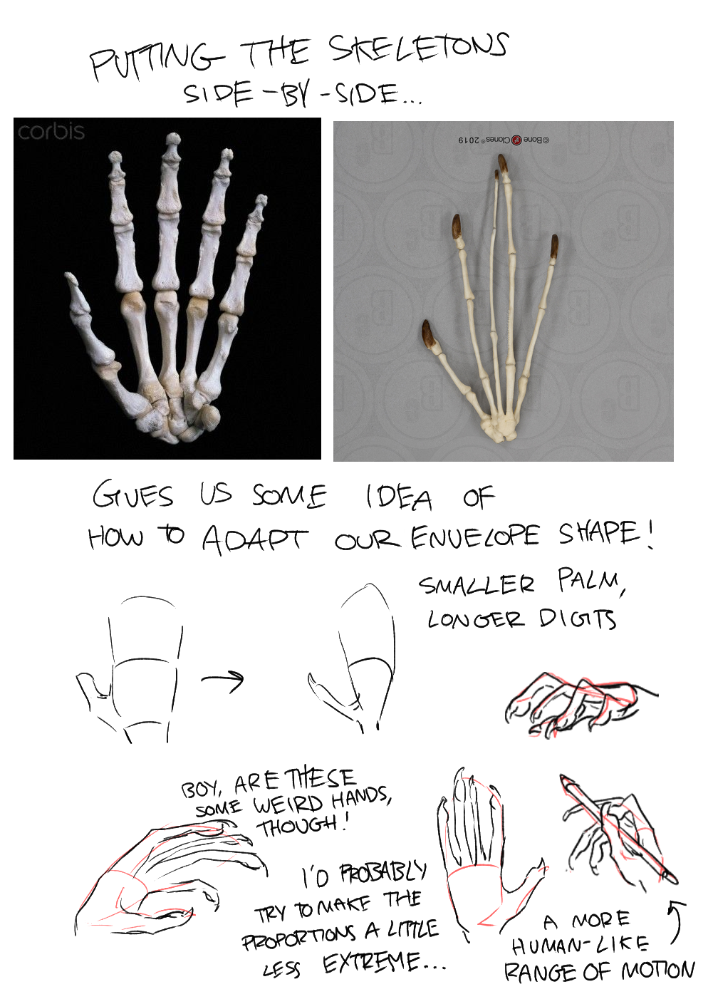
85f1f78c9bcb0998fa690633b78b2959b692f760.png
ultimately, finding an appealing way to stylise and simplify something is really tough. even the sketches at the bottom here were way trickier than i thought they'd be! my gut feeling would probably be to go with a human-ish cartoon hand and just tweak the proportions slightly - add claws, exaggerate the third and fourth fingers, and you're good to go. (if you're not married to anatomical accuracy, you could even go for a three-fingered design, and exaggerate the middle finger - ah, although now that i've written that, i can immediately think of a reason you should actually Maybe Not. but the three-fingered hands in cartoons serve a strong purpose - it leads to a clearer gesture, and honestly it's also a lot easier to draw.)

as for the second prong, here, the mechanical design constraints really hinge on what you want the character to be doing and how you want them to be able to emote. i'm not an expert on making cartoons in flash by any means! but i'm pretty sure that the usual approach is to avoid rigging the hand as much as possible, and instead just have a couple of different hand poses/symbols (and switch to a closeup hand puppet for detail shots). if i was doing something similar i'd have one bone in the hand max, and 'animate' it by deforming via squash and stretch.

after that it just becomes a question of, what do you want the hands to be doing? i think you could get a lot of mileage out of just one relaxed pose at a 3/4 view and one extra, maybe waving? if you want the character to pick up a coffee cup, is it really better to try and contort a hand rig around a cup handle, or would it just be easier to draw a new hand-holding-coffee symbol and switch it out when needed? 2D 'puppets' are kind of a midpoint between frame-by-frame 2D animation (where you need a new drawing every frame if you want to move things) and 3D animation (where animation is made almost entirely by moving and contorting a model). because of that, i think you always have to be conscious of which approach will be easier to do a different thing - treating it like a puppet, or treating it like a drawing? and which side a given action will fall on depends on the action, and also the complexity of the puppet; i think you might have more leeway to contort a simpler 3-fingered puppet, whereas for a four-fingered hand it's harder to pull off without it looking a bit weird.

all this is just my musings, though! i dunno how useful this actually is to put into practice, i've never done anything like it myself - i don't have any qualifications other than 'amateur cartoon liker', haha. i think the other thing i'd suggest is watching flash cartoons and seeing if you can figure out how they're made. try and reverse-engineer how their characters are rigged, and look out for the 'cheats' they use to animate tricky parts, like hands! i'll wrap up here because this has been equally text-wall-y, but i hope it helps!
XfL644W.png
WhPZGJa.png
Been a few months but I'm back. Love coming here for advice. This time I have two more wips, one of my D&D characters who I'm just slapping a design together for and a self portrait. Been trying to stop being a coward about drawing faces so that's why I'm doing the portrait. That and I loved my ren fest face paint. Hair is my main issue here, no idea what to do with it. My lines are still scratchy and all over so I haven't gotten past that yet. Any advice is helpful. Been trying to draw more but that doesn't mean I've actually finished anything lmao [img]https://i.imgur.com/7s3BcPU.png[/img] [img]https://i.imgur.com/ZoRUyL9.png[/img]
Been a few months but I'm back. Love coming here for advice. This time I have two more wips, one of my D&D characters who I'm just slapping a design together for and a self portrait. Been trying to stop being a coward about drawing faces so that's why I'm doing the portrait. That and I loved my ren fest face paint. Hair is my main issue here, no idea what to do with it. My lines are still scratchy and all over so I haven't gotten past that yet. Any advice is helpful. Been trying to draw more but that doesn't mean I've actually finished anything lmao

7s3BcPU.png
ZoRUyL9.png
7ec4d967d09d92be1cbc5502b91700b20e05d1c0.gif 16446.png
+ Nags +
Amateur Artist
Professional Procrastinator
Fandragon Fanatic
16438.png 1eb8ba3e2a6af91adc647d6307f1cc30fa2e6290.gif
@corvidus

Hello there!
I was wondering if it would be okay for me to pm you for art advice? I'm not too comfortable with posting my art in public ;w;
Thank you in advance!
@corvidus

Hello there!
I was wondering if it would be okay for me to pm you for art advice? I'm not too comfortable with posting my art in public ;w;
Thank you in advance!
nK1fyjz.png astramaru

she/her

» wishlist
» about
» lore
@MangoLlama
sure, of course! I don't mind giving crit over PM at all :)
@MangoLlama
sure, of course! I don't mind giving crit over PM at all :)
XfL644W.png
WhPZGJa.png
@Lasagnagsag hey! good to see you again :D i'll do the pieces in the order you posted 'em. that bust is looking really nice! you do a great job of capturing the volumes of the face and features. i think the only place this is lacking is the eyes; they look kinda flat, which is a shame (especially since they're often the focal point of a portrait!). i think they'd look better with a little more consideration given to the underlying structure: [img]https://64.media.tumblr.com/1040aa745133c355d914235bd6ff2a6c/9dfb86616c60a6e3-50/s1280x1920/24f04c0950d07f06747ebc110b33c99ae42c5bd2.png[/img] (i'm also guessing this might be partially due to the reference you used - dark makeup around the eyes would make it tricky to figure out what's going on there. this is where study and using multiple refs can be really helpful! for example, i find myself relying a lot on skeletal drawings and medical illustrations when i'm trying to figure out anatomy; they often show off details better than a photograph ever could.) hair is something i also find tricky, but i can share some tips! i'd recommend starting with the hairline on the skull, and figuring out how the hair flows from the follicles (eg, how it's parted). then i find it's easiest to try and think of it in terms of chunks! don't get too bogged down in individual strands - instead, try and start with the biggest chunks first, and slowly work in. divide and conquer! on to the fullbody! that armour is very cool. most of what i'd critique would be anatomical; your proportions overall are pretty good, but i think the hips and legs are a little too narrow. also, their stance isn't quite stable! from physics, an object is only stable if its center of mass is above its base. your character looks like they're leaning forward a little too much (and the slight top-heaviness of their build could contribute to this): [img]https://64.media.tumblr.com/3fc1fef9388d68ba359efa4c91a81efe/9dfb86616c60a6e3-49/s2048x3072/b39c914b7dd85e073861f2e3731840c0d17c9c27.png[/img] depending on what the character's build is, i might have gone too far the other way in adding bulk to the limbs. it depends on how much fat/muscle they have and how much armour (and what type) they're wearing. i roughly reffed the proportions from a person wearing plate armour, which of course bulks out the silhouette quite a bit! tighter-fitting armour might not. but the hips should be at minimum about as wide as the ribcage, because that's how the human skeleton is shaped. it's good to keep in mind the skeletal structure, because it helps guide which proportions you can adjust (because they depend on the presence of soft tissue) and which proportions are mostly fixed (because they depend on the underlying skeleton). of course, there are no rules in art, so you can change these proportions for stylistic effect... but that's a discussion for another day, haha! anyway, hope that helps :)
@Lasagnagsag
hey! good to see you again :D

i'll do the pieces in the order you posted 'em. that bust is looking really nice! you do a great job of capturing the volumes of the face and features. i think the only place this is lacking is the eyes; they look kinda flat, which is a shame (especially since they're often the focal point of a portrait!). i think they'd look better with a little more consideration given to the underlying structure:
24f04c0950d07f06747ebc110b33c99ae42c5bd2.png
(i'm also guessing this might be partially due to the reference you used - dark makeup around the eyes would make it tricky to figure out what's going on there. this is where study and using multiple refs can be really helpful! for example, i find myself relying a lot on skeletal drawings and medical illustrations when i'm trying to figure out anatomy; they often show off details better than a photograph ever could.)

hair is something i also find tricky, but i can share some tips! i'd recommend starting with the hairline on the skull, and figuring out how the hair flows from the follicles (eg, how it's parted). then i find it's easiest to try and think of it in terms of chunks! don't get too bogged down in individual strands - instead, try and start with the biggest chunks first, and slowly work in. divide and conquer!

on to the fullbody! that armour is very cool. most of what i'd critique would be anatomical; your proportions overall are pretty good, but i think the hips and legs are a little too narrow. also, their stance isn't quite stable! from physics, an object is only stable if its center of mass is above its base. your character looks like they're leaning forward a little too much (and the slight top-heaviness of their build could contribute to this):
b39c914b7dd85e073861f2e3731840c0d17c9c27.png

depending on what the character's build is, i might have gone too far the other way in adding bulk to the limbs. it depends on how much fat/muscle they have and how much armour (and what type) they're wearing. i roughly reffed the proportions from a person wearing plate armour, which of course bulks out the silhouette quite a bit! tighter-fitting armour might not. but the hips should be at minimum about as wide as the ribcage, because that's how the human skeleton is shaped. it's good to keep in mind the skeletal structure, because it helps guide which proportions you can adjust (because they depend on the presence of soft tissue) and which proportions are mostly fixed (because they depend on the underlying skeleton). of course, there are no rules in art, so you can change these proportions for stylistic effect... but that's a discussion for another day, haha! anyway, hope that helps :)
XfL644W.png
WhPZGJa.png
Thanks again for the advice, I love all the detail you put into these. You put so much into these you could probably turn this into a pwyw kinda thing. Knew something was a bit off about the eyes but wasn't sure what exactly. I'll try to fix that and get something going with the hair.

Also I find thin dudes pretty satisfying to draw but I may have overdone it just a bit with him. I definitely see what you mean about him leaning too far forward, I'll try to fix that. I'll definitely be back again sometime, hopefully with a finished drawing (but probably a different one, can't stop myself from abandoning sketches and starting new ones).
7ec4d967d09d92be1cbc5502b91700b20e05d1c0.gif 16446.png
+ Nags +
Amateur Artist
Professional Procrastinator
Fandragon Fanatic
16438.png 1eb8ba3e2a6af91adc647d6307f1cc30fa2e6290.gif
@corvidus Didn't see if you wanted to be pinged or not when posting, so i am assuming it's okay? first off i want to say: Your work is incredible! I love the gallery you have put together on your website! :D You said you would be interested in critique so i wanted to give you some as well, but i honestly can't find anything xD the only thing is that the perspective on your personal 2018 work looks off (i think it is partly because you don't go dark enough where the table edge is) but seeing as the piece is 3 years old and seeing your newer pieces i know you have gotten better at this! :D ------------- I am looking for some critique on this most recent piece of mine (the back view is still a WIP) [img]https://i.postimg.cc/5tLjtTvp/pikeman.png[/img] I would love some advice on how to render different fabrics without the use of textures. I think my attempt at a satin-like fabric on the shirt went okay, but i had a really hard time rendering the jacket which is supposed to be made of wool (and even has a texture applied to help me out) and the shoes which are supposed to be made out dyed/bleached leather additionally any notes on general anatomy would be appreciated :) i know the foot facing us head on looks super weird! i looked at so many references but i just couldn't get it to look right... Thank you! :D (sidenote: i also ran an art critique thread a while back, but stopped after i lost motivation. I think it's really admirable how long you have kept this on, and how many people you have helped with their art! c: )
@corvidus

Didn't see if you wanted to be pinged or not when posting, so i am assuming it's okay?

first off i want to say: Your work is incredible! I love the gallery you have put together on your website! :D You said you would be interested in critique so i wanted to give you some as well, but i honestly can't find anything xD the only thing is that the perspective on your personal 2018 work looks off (i think it is partly because you don't go dark enough where the table edge is) but seeing as the piece is 3 years old and seeing your newer pieces i know you have gotten better at this! :D

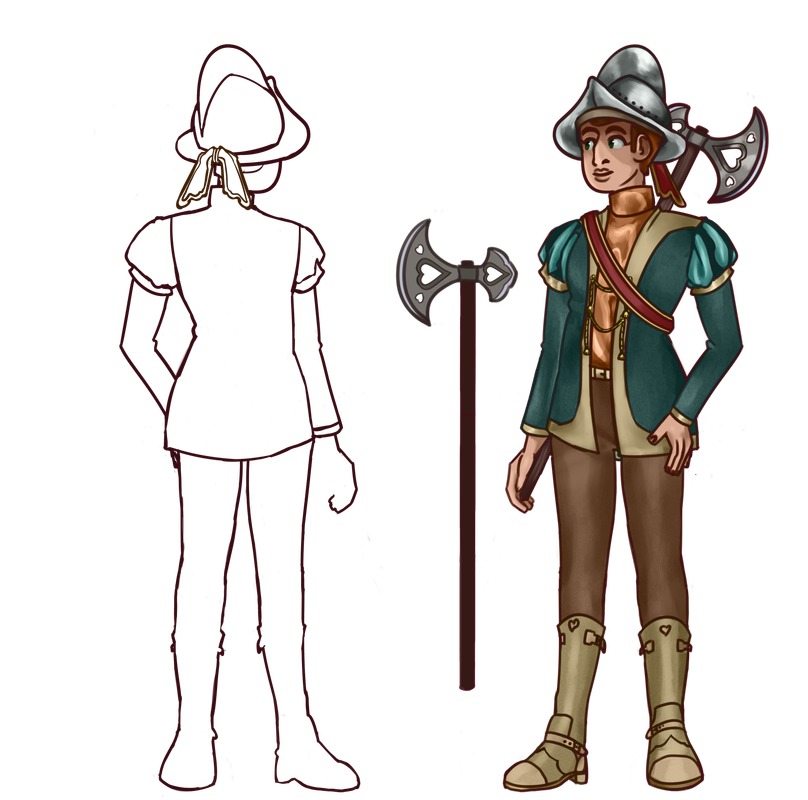
I am looking for some critique on this most recent piece of mine (the back view is still a WIP)
pikeman.png

I would love some advice on how to render different fabrics without the use of textures.
I think my attempt at a satin-like fabric on the shirt went okay, but i had a really hard time rendering the jacket which is supposed to be made of wool (and even has a texture applied to help me out) and the shoes which are supposed to be made out dyed/bleached leather

additionally any notes on general anatomy would be appreciated :) i know the foot facing us head on looks super weird! i looked at so many references but i just couldn't get it to look right...

Thank you! :D


(sidenote: i also ran an art critique thread a while back, but stopped after i lost motivation. I think it's really admirable how long you have kept this on, and how many people you have helped with their art! c: )
underskrift-geo.png
@corvidus - I'm still playing around with sketches here, but already they look so much better than what I had - your idea of blocking out the real estate really helped!! I no longer seem to have that issue with the fifth finger not fitting, so I'm super grateful. [img]https://cdn.discordapp.com/attachments/425639694320140299/829635180154191882/hands.jpg[/img] Also wanted to say - for someone who's no expert on flash, you certainly know a decent bit about it! (It's now called [i]adobe animate[/i], but that is a frankly confusing name, so I just stick with flash lol.) While older flash cartoons like 6Teen do what you say with the One Hand Pose and swapping it out offscreen, some are a bit more bold about it and swap the hand through a couple of poses where the palm is still but the fingers are placed differently, like during the first few seconds of [url=https://www.youtube.com/watch?v=2snGMZ9kDc8]this clip[/url]). Some shows will rig the fingers in each pose, so they can be wiggled a bit (though in this case I think they may have just redrawn the fingers for each frame, haha). The 3/4 relaxed hand thing got a giggle out of me - when I was a kid and just learning to make these puppets, that pose was all I used, and it's still my go-to for the idle model lol. It's very versatile! But yeah, thanks for this wall! I think I'll be coming back to it often, haha.
@corvidus - I'm still playing around with sketches here, but already they look so much better than what I had - your idea of blocking out the real estate really helped!! I no longer seem to have that issue with the fifth finger not fitting, so I'm super grateful.

hands.jpg

Also wanted to say - for someone who's no expert on flash, you certainly know a decent bit about it! (It's now called adobe animate, but that is a frankly confusing name, so I just stick with flash lol.) While older flash cartoons like 6Teen do what you say with the One Hand Pose and swapping it out offscreen, some are a bit more bold about it and swap the hand through a couple of poses where the palm is still but the fingers are placed differently, like during the first few seconds of this clip). Some shows will rig the fingers in each pose, so they can be wiggled a bit (though in this case I think they may have just redrawn the fingers for each frame, haha).

The 3/4 relaxed hand thing got a giggle out of me - when I was a kid and just learning to make these puppets, that pose was all I used, and it's still my go-to for the idle model lol. It's very versatile!

But yeah, thanks for this wall! I think I'll be coming back to it often, haha.
Dear IKTR: Fandragons are in my den! Sometimes there's a few stragglers in my lair.
mancave_banner.png


MANGENTA.png
@corvidus Ooh I love critiques Any general words of advice on this piece? I know theres some stuff wrong with it, just curious what your thoughts are specifically! ^-^ I'm always down for some nice criticism woot woot [img]https://cdn.discordapp.com/attachments/601215705915981874/828792354306654248/1617669850619.jpg[/img]
@corvidus Ooh I love critiques
Any general words of advice on this piece? I know theres some stuff wrong with it, just curious what your thoughts are specifically! ^-^
I'm always down for some nice criticism woot woot

1617669850619.jpg
giveawayglenminibanner.png
It's not hard to be nice-
help pick up what they dropped, hold the door, say hello;
but it could make someone elses day, just that little bit better
Something that seems small and insignificant to you, can mean the world to someone else

Live not for yesterday, nor for tomorrow
Live for today
17JYCdP.gif
[b][/b]@cordifolium i don't mind the ping either way! i'm also subbed, but the double-notif is a quick way to see "ooh, someone's posted in the crit thread!" first off, thank you so much for the kind words! the perspective in that bar scene is absolutely off, aha - i need to swap it out with something newer at some point. it just goes to show the value of a good perspective grid [emoji=ridgeback winking size=1] but i really do have a blast with this thread! it's a lot of fun, and i'm always really humbled that people come to me for advice. and i've learned a lot from doing it, as well! alright, let's go ahead and dive in! so: rendering different materials is mostly a question of figuring out how they react to light. the two big things to consider is how [b]diffuse [/b]is this material - how much does it scatter incoming light versus reflecting it back - and what is the [b]surface texture[/b] (matte, glossy, woven, etc).[LIST] [*] very [b]diffuse[/b] materials will have very soft, blended shadows. conversely, materials with low scattering (and high direct reflectance/transmission) will have sharper shadows that strongly depend on their surroundings. [*] materials with a smooth, polished surface are [b]glossy[/b] and will show very sharp specular (gloss) highlights. materials with a rougher, textured surface are [b]matte[/b], and will show soft or no specular highlights. [/LIST] other stuff to consider is: how does the colour/saturation of the material change with angle? how sharp or soft are the highlights? is there any subsurface scattering (such as in skin or cloudy liquid)? material studies are a great way to start getting your head around how a material should look. here's a quick sample, with a few annotations describing my train of thought: [img]https://64.media.tumblr.com/1ebda6d1f0ebf8c8071454ee0b44966a/9dfb86616c60a6e3-2f/s1280x1920/a4d4938171e0fe32c38166515aab89592bf81697.png[/img] you've already made a really good start at this on the piece you posted, honestly! you've identified that the wool should have soft, diffuse shadows, and the satin shirt should have sharp highlights that zig-zag following the contours of the material. i'd say you just need to think through the materials a little more! really try and think about how they behave in relation to light, and where you should place the highlights in correspondance with that. speaking of, the other thing that could help is a little more attention to your highlights! texture is usually most visible in the highlights, so they're invaluable for getting across information about your surface. conversely, shadows really don't carry much information about texture - remember, the best-lit areas are generally also the areas of highest detail! so even just the brush you use for your highlights, and how sharp or soft you make them, can really bring together an area. you can also use your strokes to inform texture, as well. in the cylinders above, i used back-and-forth brush strokes to paint the highlight on the rough leather, which breaks it up and makes the surface look more textured and toothy. the polished leather was done with fewer long brush strokes, all in a similar direction, to evoke a smoother, crisper highlight. stroke texture can go a long way towards giving a surface a certain feel. in terms of anatomy, it all looks pretty good! i think i can help fix the left foot - remember that the details like the buckle, etc should be at the same height as on the opposite foot: [img]https://64.media.tumblr.com/8270eed47228fc8bda962192b7494b50/9dfb86616c60a6e3-6b/s640x960/761ffc0ccd4c46530056453739d058087347024f.png[/img] and if the boots don't quite 'feel' enough like leather i'd give them a little bit more of a sheen in a few places, like down the front and on the tips of the toes. i think they look pretty great already, though. the piece is really solid overall i'd say! and i love the details like the strings between the front panels of the jacket. hope that all helps! n_n
@cordifolium
i don't mind the ping either way! i'm also subbed, but the double-notif is a quick way to see "ooh, someone's posted in the crit thread!"

first off, thank you so much for the kind words! the perspective in that bar scene is absolutely off, aha - i need to swap it out with something newer at some point. it just goes to show the value of a good perspective grid
but i really do have a blast with this thread! it's a lot of fun, and i'm always really humbled that people come to me for advice. and i've learned a lot from doing it, as well!

alright, let's go ahead and dive in! so: rendering different materials is mostly a question of figuring out how they react to light. the two big things to consider is how diffuse is this material - how much does it scatter incoming light versus reflecting it back - and what is the surface texture (matte, glossy, woven, etc).
  • very diffuse materials will have very soft, blended shadows. conversely, materials with low scattering (and high direct reflectance/transmission) will have sharper shadows that strongly depend on their surroundings.
  • materials with a smooth, polished surface are glossy and will show very sharp specular (gloss) highlights. materials with a rougher, textured surface are matte, and will show soft or no specular highlights.

other stuff to consider is: how does the colour/saturation of the material change with angle? how sharp or soft are the highlights? is there any subsurface scattering (such as in skin or cloudy liquid)? material studies are a great way to start getting your head around how a material should look. here's a quick sample, with a few annotations describing my train of thought:
a4d4938171e0fe32c38166515aab89592bf81697.png

you've already made a really good start at this on the piece you posted, honestly! you've identified that the wool should have soft, diffuse shadows, and the satin shirt should have sharp highlights that zig-zag following the contours of the material. i'd say you just need to think through the materials a little more! really try and think about how they behave in relation to light, and where you should place the highlights in correspondance with that.

speaking of, the other thing that could help is a little more attention to your highlights! texture is usually most visible in the highlights, so they're invaluable for getting across information about your surface. conversely, shadows really don't carry much information about texture - remember, the best-lit areas are generally also the areas of highest detail! so even just the brush you use for your highlights, and how sharp or soft you make them, can really bring together an area. you can also use your strokes to inform texture, as well. in the cylinders above, i used back-and-forth brush strokes to paint the highlight on the rough leather, which breaks it up and makes the surface look more textured and toothy. the polished leather was done with fewer long brush strokes, all in a similar direction, to evoke a smoother, crisper highlight. stroke texture can go a long way towards giving a surface a certain feel.

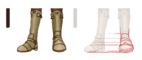
in terms of anatomy, it all looks pretty good! i think i can help fix the left foot - remember that the details like the buckle, etc should be at the same height as on the opposite foot:
761ffc0ccd4c46530056453739d058087347024f.png
and if the boots don't quite 'feel' enough like leather i'd give them a little bit more of a sheen in a few places, like down the front and on the tips of the toes. i think they look pretty great already, though.

the piece is really solid overall i'd say! and i love the details like the strings between the front panels of the jacket. hope that all helps! n_n
XfL644W.png
WhPZGJa.png
1 2 ... 76 77 78 79 80 ... 86 87