Back

Creative Corner

Share your own art and stories, or ask for critique.
TOPIC | i'll critique your art! (rules upd8)
1 2 3 4 5 6 7 ... 86 87
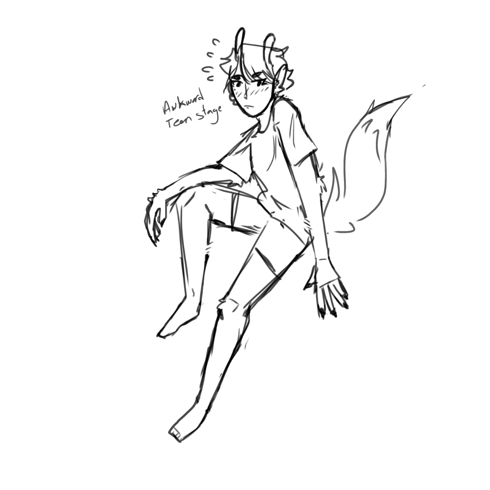
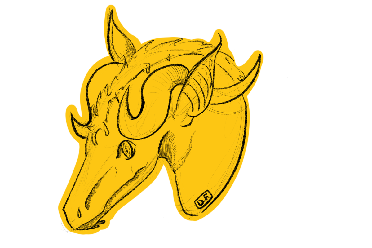
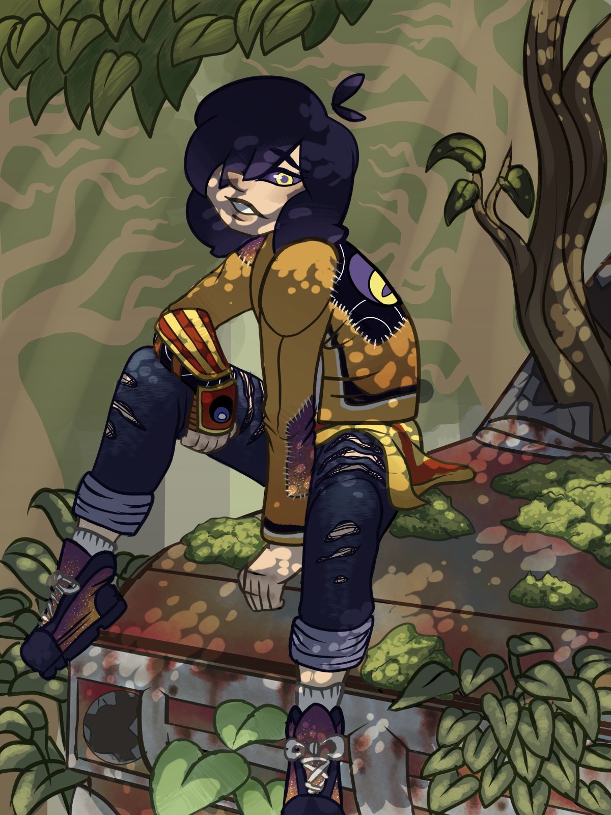
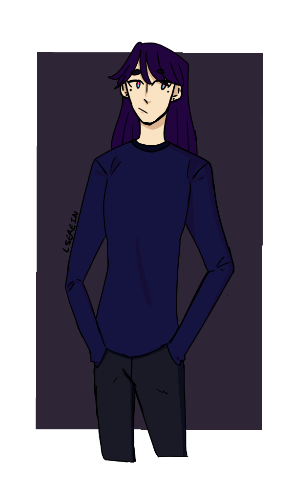
@corvidus Hello! I’d welcome any criticism because it helps me improve. I have a pretty inconsistent style so I’m working towards that at the moment. [img]https://66.media.tumblr.com/c64948dd465164a09c6d4345f08e96db/802d9e64dde85f1e-fa/s1280x1920/c2ac283db84cc9f3a8e44e67146d410bd0ac0e82.png[/img] [img]https://66.media.tumblr.com/227e30ff996449ed56801111d7f85f13/af9bdb5d8a631d56-c1/s1280x1920/e9d38d1ee95e869520bd1f0af5e0b118b5d7270e.png[/img] [img]https://66.media.tumblr.com/2862d5f7d6f5dfec94125e60f42f54c1/190f28db69fdf5b2-6c/s1280x1920/08e0eba107a9a40d89369f8e80a5ee851127ef30.png[/img]
@corvidus
Hello! I’d welcome any criticism because it helps me improve. I have a pretty inconsistent style so I’m working towards that at the moment.

c2ac283db84cc9f3a8e44e67146d410bd0ac0e82.png

e9d38d1ee95e869520bd1f0af5e0b118b5d7270e.png

08e0eba107a9a40d89369f8e80a5ee851127ef30.png
I'm Broke
@corvidus Here's my most recent piece of (finished) art. I don't usually do backgrounds, so it was an interesting experience... I'd love any input on how I can improve :) (Click image to see full size) [url=https://i.imgur.com/JglWJKM.png][img]https://i.imgur.com/JglWJKM.png[/img][/url]
@corvidus
Here's my most recent piece of (finished) art. I don't usually do backgrounds, so it was an interesting experience... I'd love any input on how I can improve :)

(Click image to see full size)
JglWJKM.png
oAK3y8z.png AfamSig.gif
@corvidus

I present to you the best thing I have ever drawn and the best thing I ever will draw. Her names is Viridian and she is one of my OCs outside FR. I've never used color beside for lines, but now that my writing hobby has hit a wall, I am interested in getting back to drawing.

http://fav.me/dd0w8io
woah, this got a lot more interest than i was expecting! not that i'm complaining, haha. i'm gonna start putting multiple of these in each post so i don't clog the thread too much.

@jade93
for only a year of practise, you've got a really strong start! i like that you're experimenting a lot in your use of shapes and styles (the bendy-esque dragons are particularly cute <3), and i especially like the first picture - the dragon's eye really draws the, well, eye!

i think at this stage, your art could really benefit from doing some photo studies or life drawings. it looks like you're building up a good ability to stylize shapes, but that needs to be backed up with a solid knowledge of anatomy and form. even if you don't plan on drawing realism, knowing how real people and animals look is still really helpful - it'll give you something to fall back on when you're stuck on how to draw something, like the dragon's talons in the first picture. i'd also like to see you try out some shading! it'll help you to think a bit more about the shapes your drawings are occupying in 3D, and add another level to help bring your drawings to life!

@junu
of course! starting off, i think there's a lot to like about your art. it's very polished and visually pleasing! i love the use of halftones, it gives a really nice texture to the pieces.
i'd say the biggest thing regarding your shading is you need to be more conscious about where your shadows are falling, if that makes sense? there's not really a clear light source in any of them. if we take picture one for example, the shadows on the right of the face imply a light source in the top left, but the shading on the neck, the shoulders and the left-hand cheekbone kind of contradict that. i think your knowledge of form is good, you just need to be a little bit more deliberate with your shadow placement - maybe try experimenting with some more extreme/oddly placed light sources and deeper shadows to help you get the hang of it.

i think your anatomy is solid, but there's a couple things to work on. the hands are standing out to me as one, but in fairness hands are super hard to draw (i struggle with them a lot...) - i think you'll just get there with more practise, especially as you're already trying out different poses with them. i'd say focus on the form and structure of the palm more, make sure all of your knuckles are in the right places - i think the way the fingers taper at the last digit is a little odd, too, but i'm not sure if it's just a stylistic choice. your faces are a teensy bit same-y, as well - i'd love to see you experiment with different eye or nose shapes, different jawlines, etc. i find drawing from photos of real people is the best practice for this; there are collections of different faces you can find online, but my favourite is finding photos from like a red carpet event and drawing all the attendees, haha.

i hope this is helpful! i really like your art overall, i think there's a ton of personality and life in your drawings. there's definite improvement between the last and the first in terms of pose, composition and knowledge of shape (the head tilt is really lovely and well-rendered!), so honestly just keep at it!
XfL644W.png
WhPZGJa.png
@Ghilanian
ah, your art is so cute!! i love that sludgy bog haha.
i think the line of action in the first picture could be stronger. at the moment, what's happening with the tail is kind of obscured by the hind legs. building the pose around a cleaner line of action would help it read better and give it more visual impact. if you're unfamiliar with the concept, i'd definitely recommend looking into it! it can really help push your poses.
i'd like to see you push your shading a little more, as well! i love the colours you used on the bog, but the areas of shadow don't really help sell the volume of the piece. try being a bit more deliberate when you place your shadows down to really emphasise the shapes. doing still live studies of simple objects (cubes, cylinders) can help you get a grasp on how to use shading to emphasise volume.

i think your art is really cute and has a strong visual style, so just brushing up some of the fundamentals to neaten up your poses and shading will really make it pop!

@InfectedWolf
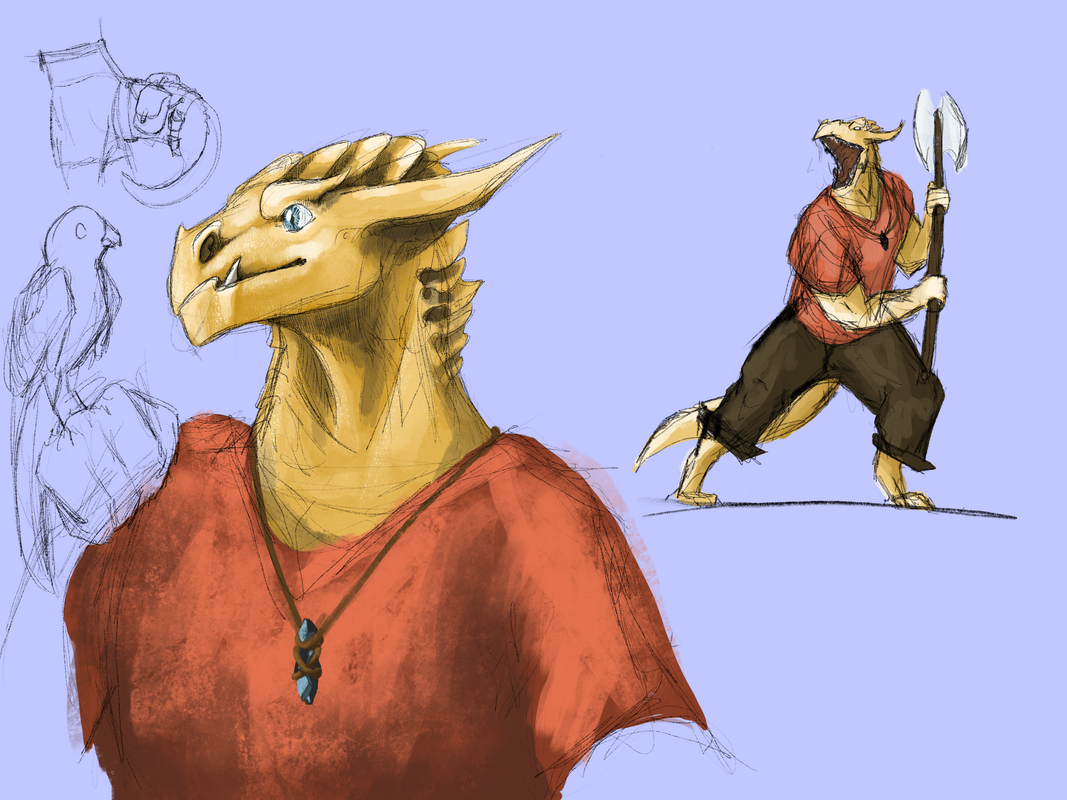
for what it's worth, i think your linework is really nice! that first bust is super crisp.
i think my biggest suggestion would be to work on your anatomy fundamentals a bit more. your art is very stylish, but i think you're focusing a bit too much on stylization and symbols, if that makes sense? taking the lynx-like creature in the second picture - the shapes you use in the shoulder and hip areas aren't quite true to life, but i see a lot of people drawing them like that anyway. i think it's the kind of thing that just tends to 'catch on' in online communities, haha.
there's nothing wrong with it! but if you focus on symbols without spending time on your anatomy basics you're holding your improvement back. this page has a couple of images you could use for reference:
http://ljcarr1044.blogspot.com/2017/10/canadian-lynx-in-maine.html
you'll see that the shoulder and hip connections are a lot less defined, the back is smoother, and overall the body is a lot longer compared to the legs.

i think your art really just needs more of a "nudge" in the right direction. you've got clean lines and a nice, distinct style, so i think a little bit more of a focus on anatomy will really help! do some drawings of real animals to help build up your knowledge of shapes and forms. if you're having trouble with shading, life drawings can help with that, as well! pay attention to the 3D shapes that animals are built out of - the better you can visualise them, the easier it will be to add shading.

@Shanora
thank you! <3
honestly, at the moment i don't have one single piece of feedback for you - i think you should just keep drawing! i can already see some really strong improvement between your pieces, and you're experimenting a lot with subject and style, which is fantastic and the best thing you can be doing as a beginner artist. it can be helpful to find some artists whose work you really like and try and analyse things you like about it, but honestly there's nothing special you should be doing right now. the more you draw, the more you'll improve, so just keep at it!
XfL644W.png
WhPZGJa.png
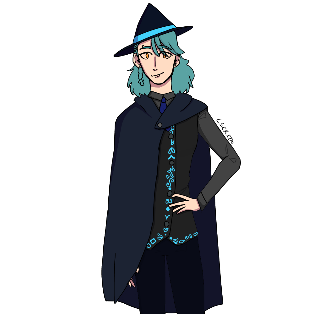
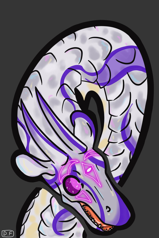
@corvidus Gimme all u got [img] https://i.postimg.cc/LXvX6y5Q/Untitled-Artwork-9.png[/img] A sketch page thing for a dnd character [img] https://i.postimg.cc/bJ5TMRPW/Untitled-Artwork-17.jpg[/img] [img] https://i.postimg.cc/MZdxcMD4/Untitled-Artwork.png[/img] An example in my art shop lol
@corvidus
Gimme all u got
Untitled-Artwork-9.png
A sketch page thing for a dnd character
Untitled-Artwork-17.jpg
Untitled-Artwork.png
An example in my art shop lol
Wassup my bros
thank you for the tips! ill be honest, i noticed my shading problems but never really tried to fix it, ill pay more attention to it in the future. ill try to fix the recent one at least. i didnt actually notice the hand issues, so thank you for pointing it out! for the most part i take my own pictures as references for hands, with the exception of the third which i found online. thanks again ^^ i will try my best in the future to draw better :)
fkWjutW.png
dEo6ta2.png
3J4E2hk.png
CioCFC3.png
6YousWl.png
(I'm on my mobile as i write these,so apologies if there are any typoes!)
@LittleRain
your stylisation is nice, and i like your linework! but you use the same facial features (eyes, nose, jawline) for all of your figures, which suggests to me you don't have much of a visual library built up. try looking at varied faces from different ethnicities, age groups, etc, and drawing what you see. a 'style' is ultimately how you interpret different 3D elements into a 2D image, and the more reference material you have to draw from, the more your style will evolve and emerge.

i think your figures are also looking a little flat - the first two static are front views with minimal shading. i like the tilt of the shoulders in the third sketch! it brings more life to the piece, and i think that's another area you should try and focus on. the best way to improve this is life drawing, either from photos or real flesh people if you're lucky enough to have a class nearby! it's kind of a drag at first imho, but it really is the best form of practice. i think you definitely have the skills to vary your poses a bit more, you just need to put it into practice :)

@Razatharia
oh, gorgeous! i think it's a shame if you don't do backgrounds very often, because this one turned out so well :D

i like the composition, but it's a little unclear as to the focus of the piece. the banescale in the foreground and the lava eruption in the background both share very similar colours. it's good to tie your subject and background together, but it makes it unclear where the eye is supposed to be focusing. you should usually base your compositions around a focal point that the viewer should look at first, but my eye is being drawn between -two- bright yellow things that almost mirror each other, and i feel like the impact loses out a little as a result.

the other problem with using the same colour in the foreground and the background is it creates very little visual distance between the two. it's hard to place the scale of the eruption in the background - is it huge and far away, or smaller and closer? under normal lighting, colours tend to get more faded and bluer the father away they are - that's why far-off mountains look blue, for example. if there's a lot of smog and reddish lighting in the air, they might instead fade to a more red or purple colour. I'd personally use a cooler red/orange for the far-off eruption to show distance.

finally, your overall palette is very cool-coloured. the sky is very blue, and the banescale is almost greenish in places. this gives a really nice contrast with the yellow, but it makes the overall picture feel very cool and subdued - i don't get much of a feeling of 'heat' from it. that's fine if it was intentional - i actually really like the somber vibe! but it's important to think about your colour choices carefully when selecting them.

overall i really love this piece! i hope you stick with backgrounds because i would love to see more from you, honestly :)
XfL644W.png
WhPZGJa.png
@corvidus thank you so much!

Yeah, now that you've pointed it out, I can see what you mean about lacking a focal point; that wasn't even something I thought to keep in mind. As for the cool shading, since I don't actually do scenes often, I'm just used to the "warm highlights cool shading" rule for natural-looking lighting haha. I liked the cold contrast, and wanted to avoid accidentally making all the colours too similar/muddled-looking, which is another reason why I went with it, but maybe I went a little overboard with the cool pallet XD

I definitely noticed that my background looks flat, and I wasn't sure how to fix that, but as you pointed out, the background and foreground are the same colour, which doesn't give much perspective. I'll definitely keep this in mind next time I do a background!

Again, thank you so much, this has been very insightful, and I appreciate the tips and feedback!! <3

I actually have another piece with a background, though it's a bit older, I'm still really proud of it (it was a gift for my friend). It's here if you want to see it (and perhaps give your opinion on it)

oAK3y8z.png AfamSig.gif
@corvidus This is my most recent piece. [img]https://dl.dropbox.com/s/sccrrlosi90t1g6/Io.jpg[/img]
@corvidus
This is my most recent piece.

Io.jpg
1 2 3 4 5 6 7 ... 86 87