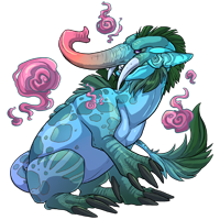
TOPIC | Familiar Coloring Contest Discussion
More favourites! (See my earlier post for previously mentioned faves.)
Leaf Cat:
@Wookieinmashoo (pg 28) (image)
Buttersnake:
@Smugwing (pg 20) (image)
@Zwynx (pg 22) (image)
@Vergolophus (pg 23) (image)
@Murcifer (pg 27) (image)
Leaf Cat:
@Wookieinmashoo (pg 28) (image)
Buttersnake:
@Smugwing (pg 20) (image)
@Zwynx (pg 22) (image)
@Vergolophus (pg 23) (image)
@Murcifer (pg 27) (image)
@Fallaryn Thanks :D
Just tell me if you have any feedback for it too, improvements are always welcome~
Just tell me if you have any feedback for it too, improvements are always welcome~
@Fallaryn Thanks :D
Just tell me if you have any feedback for it too, improvements are always welcome~
Just tell me if you have any feedback for it too, improvements are always welcome~
@Fallaryn http://i647.photobucket.com/albums/uu196/zxke/secondgarter_edited-4.png ?
Any thing else you think I should fix up?
Any thing else you think I should fix up?
@Fallaryn http://i647.photobucket.com/albums/uu196/zxke/secondgarter_edited-4.png ?
Any thing else you think I should fix up?
Any thing else you think I should fix up?

I just went through the entire thread (whew!) and there are a lot of entries that are really cool but don't really mesh well with flight rising's style. :(
FR has very sharp, defined, "cell" shaded colors. Any color fades looks like they've been made via the gradient tool (from what I can tell in the bestiary). I would take a guess that most of the patterns are done with a lasso tool.
Here's a couple examples:
[img]http://flightrising.com/images/cms/familiar/art/648.png[/img][img]http://flightrising.com/images/cms/familiar/art/415.png[/img][img]http://flightrising.com/images/cms/familiar/art/403.png[/img]
Even though these familiars have complex markings and colors, the colors are blended together with gradients and the markings are all very solid with no color blends.
Just a little food for thought, and this is all my opinion and interpretation of the contest guidelines, of course.
I just went through the entire thread (whew!) and there are a lot of entries that are really cool but don't really mesh well with flight rising's style. :(
FR has very sharp, defined, "cell" shaded colors. Any color fades looks like they've been made via the gradient tool (from what I can tell in the bestiary). I would take a guess that most of the patterns are done with a lasso tool.
Here's a couple examples:


Even though these familiars have complex markings and colors, the colors are blended together with gradients and the markings are all very solid with no color blends.
Just a little food for thought, and this is all my opinion and interpretation of the contest guidelines, of course.
FR has very sharp, defined, "cell" shaded colors. Any color fades looks like they've been made via the gradient tool (from what I can tell in the bestiary). I would take a guess that most of the patterns are done with a lasso tool.
Here's a couple examples:


Even though these familiars have complex markings and colors, the colors are blended together with gradients and the markings are all very solid with no color blends.
Just a little food for thought, and this is all my opinion and interpretation of the contest guidelines, of course.
morgan: 31, he / they - art shop
I see that a few actually enjoy my submission very much, but what slothbug said, I do feel like mine is not very fitting to Flight Rising's coloring style.
I just entered for the hell of it, but now I hope that they ask for you to send a PSD via somewhere for further adjustments.
Mine is basically all flats and a color scheme that works well together, but I might be too much of a fan for natural and possible colorations rather than the neon pixie dust fantasy is known for.
But seriously, thank you for the feedback. I was really surprised to become one of some people's favorites.
Tell me why a piece of cloth costs half a million gold.
@slothbug
That's why I'm hoping, when I have the time, to go in and actually make it a smooth style versus the painterly style.
That's why I'm hoping, when I have the time, to go in and actually make it a smooth style versus the painterly style.
@slothbug
That's why I'm hoping, when I have the time, to go in and actually make it a smooth style versus the painterly style.
That's why I'm hoping, when I have the time, to go in and actually make it a smooth style versus the painterly style.

Ok I'm having problems, lol. I can't get rid of the instructions that are included to go away when saving, lol. Are they supposed to stay there? I see the pics in submissions with no writing.
Ok I'm having problems, lol. I can't get rid of the instructions that are included to go away when saving, lol. Are they supposed to stay there? I see the pics in submissions with no writing.
@Beaker - I just went back and found yours and dang is it pretty! But I definitely think it would benefit if it matched fr's style a little more. I don't think you'd have to change it too much though! Fab color choices.
@Vergolophus - I think with the shading yours will fit the style very well. :) fr has several natural colored familiars, so they definitely don't have to be ~bright~
@Aten - I didn't know you had a brb?! What a cute little thing
@Vergolophus - I think with the shading yours will fit the style very well. :) fr has several natural colored familiars, so they definitely don't have to be ~bright~
@Aten - I didn't know you had a brb?! What a cute little thing
morgan: 31, he / they - art shop


