Back

Dragon Share

Show off your favorite dragons.
TOPIC | Dragon/Lair reviews!! (paused)
1 2 ... 6 7 8 9 10 11 12
@Redtiger7736 What a wonderful review! So enjoyable to read. :3

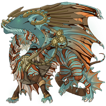
Oh, Jaro, my beautiful spring boy. I'm glad he gets the recognition he deserves, I love him so darn much. I'm looking forward to writing about him, although first I need to come up with a reason for his existence in my clan, as he is the season of Spring personified (dragonfied?).

I'm kinda surpised, but maybe I shouldn't be? Two reviews of my clan in the past few days and both times my witch was mentioned and very praised. I really need to come up with a good name for her and I'm afraid I could do it wrong. :S

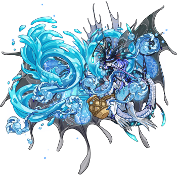
Delyth is an awesome icy huntress and I'm happy she is appreciated. :3

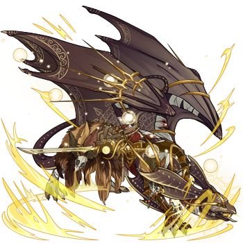
Dust, oh Dust. I'm happy for her that you appreciate her. I was struggling with her apparel for so long and then someone suggested a little bit of black on her - and I knew exactly that she did indeed need that. Although now I don't really know where to go next with her - I'll probably try to finish geneing her first before putting any more apparel pieces on her.

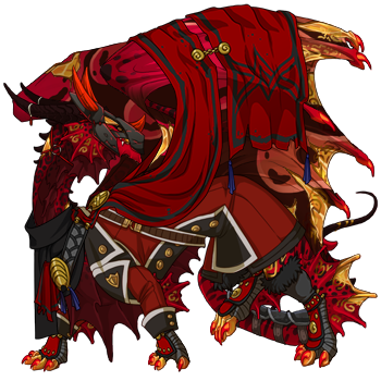
And Riyah, probably a dragon I'm proud of the most right now every time I look at her. (okay, maybe Agni actually makes me prouder, but that's only because he was a really expensive gene project) I'm so close to starting her story, next time I'm in a dragon writing mood, it's probably going to be her. And while the title might seem a bit... dangerous? Edgy? It's actually the name of the class in WoW she's supposed to represent. Maybe I'll even change it after her story is finished, but we'll see about that.


Um... that was a bit too much text, damn it. Sorry for that. Once again, thank you for the review! I love it. ^^
CgtyAYW.png
@klee this will be my final review for the night, as I have a story I need to write as well. My top 5 from your lair, in no particular order! [url=http://flightrising.com/main.php?dragon=25995496] [img]http://flightrising.com/rendern/350/259955/25995496_350.png[/img] [/url] 1) Witch is such a gorgeous dragon that treads away from the typical gold and black dragon. First off, her colors aren't straight up gold and black, the eldritch provides a subtle green undertone while the cream is a nice warmer tint that brings in the gold and lighter shades of yellow wonderfully. I love the use of basic on her as well, it really allows the runes to stand out and gives you more room to mess around with accent and apparel texture. The cream stripes also does a magnificent job at balancing the darker textured area of her wings with the bright lightness of the feathered part of them. That cream lightness really pulls in the flowering gladeboughs and sets a theme of almost Narnian enchanted forest, particularly with the faerie rose thorn apparel and the draping of the golden silks. The accent you chose for her was also a great choice, as it really gives a nice bit of texture to her wings and pulls in the gold throughout her figure, without overwhelming her texture and colorwise. [url=http://flightrising.com/main.php?dragon=21544084] [img]http://flightrising.com/rendern/350/215441/21544084_350.png[/img] [/url] 2) IV is such an interesting looking dragon, particularly with how his apparel and genes work together. The python and stripes are relatively untextured genes, and the dark accents that abyss gives to his wings makes the silver of his accent and smoke stand out so much more, but still match with the rest of his color scheme. The soft textures of python give his body enough interest on its own, but the smoke adds an extra bit of spice that blends well enough to not be an eyesore. His apparel also very smoothly works into his look, but also elevates him with more hues of grey and movement. The unearthly onyx set matches incredibly well with his accent, the silver hue and white gems bringing that pop of brightness like snow in the nighttime, which I think works really well with the icy apparel you also included. The halo and winter wind have such light blue accents that they aren't out of place, but rather pull a little on the abyss coloring and provide some different tones to look at, drawing the eyes attention. Additionally, the winter wind and flowerfall give some motion and additional detail that draw attnetion throughout his entire look. As more of a side note, I love the significant of his name; lore wise, it's marvelous, considering he is a leap year hatch. This is one valuable dragon you have--an XYX gened gen1 leap year coatl with a 2 letter name. Bravo! [url=http://flightrising.com/main.php?dragon=30295234] [img]http://flightrising.com/rendern/350/302953/30295234_350.png[/img] [/url] 3) Maya proves the undervalued color algae can be an absolutely amazing choice if done correctly. The softness of the green in algae is perfect for iri/shim, particularly since its accent colors aren't overly saturated or out of left field. It leaves room for the caramel runes to pull in the warmer tones of her primary and secondary, and I think it really sets the stage for the almost summer witch feel I get from her. The accent you chose for her is not something I would first have though, as it really takes some darker colors and brighter oranges that don't match at first, though the bandages really go well with her runes. However, I find through her outfit, you really incorperated the accent in well. For the most part you left the black alone, letting it draw attention her her and give some emphasis on her, as her colors are soft and don't really call attention to her as a whole. However, you take the brighter oranges and roll with them, with the citrine teardrop apparel, haunting clawrings, and marigold flowerfall you flawlessly incorperate the odd color into the rest of her. Additionally, you blend the ivory of her bandages and the black in with the candles, pulling those in in a more subtle way while adding some shape and movement to her. A gorgeous dragon! [url=http://flightrising.com/main.php?dragon=16149500] [img]http://flightrising.com/rendern/350/161496/16149500_350.png[/img] [/url] 4) Epidemia is an interesting looking dragon, the atypical plague aesthetic but still a creepy and powerful looking dragon. Blood is always a gorgeous color with the rich reds it offers, and I see you plan for her to get python which I think is a great choice, as it deepens the color and provides a very nice pattern. The white capsule is an eyecatching addition but not out of place, particularly since all the red and brown tones are fairly close to neutral darkness which allows white to enter naturally. Personally, I think if you are willing to save for butterfly, I would do it, as the additional dark tones on her head and tail feathers really elevates the look and matches her primary better once python is on. Her accent and apparel make it less necessary for her wings though. I love how the dull, grey-blacks of the accent offset the richness of chocolate as a color and brings in some softer golds that border on brown and work really well with her look. While I think bright golds would work, she honestly looks better with the softer tones, allowing her natural beauty to take center stage. The flowerfall is a really nice addition, as it has just the right touch of color to bring some of the more red tones out of blood and the yellow tips bring the brighter tones from the gold. The halo also moves her look from 'demon or goddess' to 'ancient and powerful possibly undead being', which is what gave me the plague idea in the first place. [url=http://flightrising.com/main.php?dragon=16497178] [img]http://flightrising.com/rendern/350/164972/16497178_350.png[/img] [/url] 5) Kruonis is my final pick, and boy is she a gorgeous one. Purple and gold is a common use of colors, but I think the way you've done it here takes it on a totally different look, rather than kingly or royal more goddess like, truely fitting of the gorgeous art you have of her. Typically, I find cry/face overtextured and needing to be balanced with a covering tertiary or apparel, but here you've done the opposite to balance her. You used the dark purples of shadow to your advantage and added some darker hints to accent the white beautifully, while the accent you chose is actually More textured than her genes. Interestingly, I find that enjoyable, as the brightness of the gold and beautiful shading method used takes the cry/face look and pushes it towards ethereal, a true thing of beauty. I love how you let her accent shine through, as I think it really sets her tone and adds a lot of visual interest. The golden seraph apparel is a nice addition as well, as it pulls in the same bright gold tones with more texture variation, yet doesn't cover up any of the beauty of her apparel. The violet flowerfall mixes the purple in well, as it balances the whiteness of her primary and makes sure the gold doesn't get too out of hand; gold and white are nice, but I think the start of the show is the additional bright purple. Gorgeous dragon I would steal in a heartbeat.
@klee this will be my final review for the night, as I have a story I need to write as well. My top 5 from your lair, in no particular order!

25995496_350.png

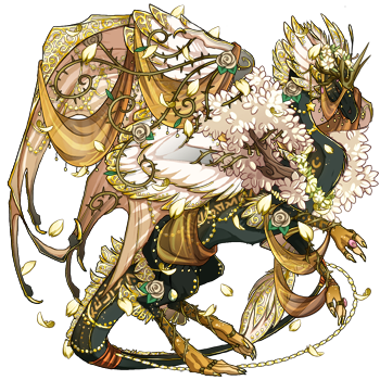
1) Witch is such a gorgeous dragon that treads away from the typical gold and black dragon. First off, her colors aren't straight up gold and black, the eldritch provides a subtle green undertone while the cream is a nice warmer tint that brings in the gold and lighter shades of yellow wonderfully. I love the use of basic on her as well, it really allows the runes to stand out and gives you more room to mess around with accent and apparel texture. The cream stripes also does a magnificent job at balancing the darker textured area of her wings with the bright lightness of the feathered part of them. That cream lightness really pulls in the flowering gladeboughs and sets a theme of almost Narnian enchanted forest, particularly with the faerie rose thorn apparel and the draping of the golden silks. The accent you chose for her was also a great choice, as it really gives a nice bit of texture to her wings and pulls in the gold throughout her figure, without overwhelming her texture and colorwise.

21544084_350.png

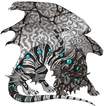
2) IV is such an interesting looking dragon, particularly with how his apparel and genes work together. The python and stripes are relatively untextured genes, and the dark accents that abyss gives to his wings makes the silver of his accent and smoke stand out so much more, but still match with the rest of his color scheme. The soft textures of python give his body enough interest on its own, but the smoke adds an extra bit of spice that blends well enough to not be an eyesore. His apparel also very smoothly works into his look, but also elevates him with more hues of grey and movement. The unearthly onyx set matches incredibly well with his accent, the silver hue and white gems bringing that pop of brightness like snow in the nighttime, which I think works really well with the icy apparel you also included. The halo and winter wind have such light blue accents that they aren't out of place, but rather pull a little on the abyss coloring and provide some different tones to look at, drawing the eyes attention. Additionally, the winter wind and flowerfall give some motion and additional detail that draw attnetion throughout his entire look. As more of a side note, I love the significant of his name; lore wise, it's marvelous, considering he is a leap year hatch. This is one valuable dragon you have--an XYX gened gen1 leap year coatl with a 2 letter name. Bravo!

30295234_350.png

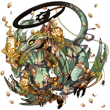
3) Maya proves the undervalued color algae can be an absolutely amazing choice if done correctly. The softness of the green in algae is perfect for iri/shim, particularly since its accent colors aren't overly saturated or out of left field. It leaves room for the caramel runes to pull in the warmer tones of her primary and secondary, and I think it really sets the stage for the almost summer witch feel I get from her. The accent you chose for her is not something I would first have though, as it really takes some darker colors and brighter oranges that don't match at first, though the bandages really go well with her runes. However, I find through her outfit, you really incorperated the accent in well. For the most part you left the black alone, letting it draw attention her her and give some emphasis on her, as her colors are soft and don't really call attention to her as a whole. However, you take the brighter oranges and roll with them, with the citrine teardrop apparel, haunting clawrings, and marigold flowerfall you flawlessly incorperate the odd color into the rest of her. Additionally, you blend the ivory of her bandages and the black in with the candles, pulling those in in a more subtle way while adding some shape and movement to her. A gorgeous dragon!

16149500_350.png

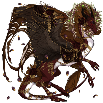
4) Epidemia is an interesting looking dragon, the atypical plague aesthetic but still a creepy and powerful looking dragon. Blood is always a gorgeous color with the rich reds it offers, and I see you plan for her to get python which I think is a great choice, as it deepens the color and provides a very nice pattern. The white capsule is an eyecatching addition but not out of place, particularly since all the red and brown tones are fairly close to neutral darkness which allows white to enter naturally. Personally, I think if you are willing to save for butterfly, I would do it, as the additional dark tones on her head and tail feathers really elevates the look and matches her primary better once python is on. Her accent and apparel make it less necessary for her wings though. I love how the dull, grey-blacks of the accent offset the richness of chocolate as a color and brings in some softer golds that border on brown and work really well with her look. While I think bright golds would work, she honestly looks better with the softer tones, allowing her natural beauty to take center stage. The flowerfall is a really nice addition, as it has just the right touch of color to bring some of the more red tones out of blood and the yellow tips bring the brighter tones from the gold. The halo also moves her look from 'demon or goddess' to 'ancient and powerful possibly undead being', which is what gave me the plague idea in the first place.

16497178_350.png

5) Kruonis is my final pick, and boy is she a gorgeous one. Purple and gold is a common use of colors, but I think the way you've done it here takes it on a totally different look, rather than kingly or royal more goddess like, truely fitting of the gorgeous art you have of her. Typically, I find cry/face overtextured and needing to be balanced with a covering tertiary or apparel, but here you've done the opposite to balance her. You used the dark purples of shadow to your advantage and added some darker hints to accent the white beautifully, while the accent you chose is actually More textured than her genes. Interestingly, I find that enjoyable, as the brightness of the gold and beautiful shading method used takes the cry/face look and pushes it towards ethereal, a true thing of beauty. I love how you let her accent shine through, as I think it really sets her tone and adds a lot of visual interest. The golden seraph apparel is a nice addition as well, as it pulls in the same bright gold tones with more texture variation, yet doesn't cover up any of the beauty of her apparel. The violet flowerfall mixes the purple in well, as it balances the whiteness of her primary and makes sure the gold doesn't get too out of hand; gold and white are nice, but I think the start of the show is the additional bright purple. Gorgeous dragon I would steal in a heartbeat.
Wishlist (for now)
@Balaeniceps Alright, here we go! Top 5 from your lair, in no particular order. [url=http://flightrising.com/main.php?dragon=49450300] [img]http://flightrising.com/rendern/350/494504/49450300_350.png[/img] [/url] 1) Prokhor is a gorgeous example of how yo use unpopular genes to your advantage. His monotone color pallet is a great way to work the various textures of the genes together nicely, and I particularly like how the dark stripes on lionfish match oilslick so well. I really love that your changing his secondary to poison, as it keeps the lighter tones that match with his lionfish while also adding in the darker blacks that match with the other stripes on lion and the smirch, plus the movement of poison fits better with lion and smirch. His eyes are such a great look too, they pop out color wise and give him a lot of charcater while allowing you a point to jump off of for other accent colors. His outfit is really well done and thought out too, with the contrast aviator coat taking off the majority of the over-textured areas of lion while the furious gear adds some more visual interest and shapes yet sticks with the color scheme. The sword is a nice addition and the brown it adds gives some variation while sticking to the darker cooler tones. My favorite part is how you worked in the blue of his eyes with the halo and scale wingplates, its just enough color to make him pop. [url=http://flightrising.com/main.php?dragon=160373] [img]http://flightrising.com/rendern/350/1604/160373_350.png[/img] [/url] 2) Sala is another gorgeous guardian, with the ferocity she shows I just had to pick her. Crimson and rust are very rich reds, particularly with the contrasting shades brought in with jag/morph. I've always enjoyed the dark underbellies that females guardians get with most primary genes, and here it does a fantastic job at bringing out the orange-yellows of the opal to a greater degree. The outfit is another well developed one, with the golds of the banner bringing in the opals color while the red matches the crimson beautifully. The aviator gear is also really nice, the coats are underused in my opinion, but here they provide a regal sense of danger, particularly with the furious boots and gloves accenting the black with some armor. Aesthetically, she's a regal but dangerous dragon, taking a different spin on the black/red/gold color scheme a lot of people use for that. Wow, her lore is spot on to her looks, and absolutely gorgeously written. The imagery of her commanding her troops on the battlefield and her determination to Protect her clan is powerful, that final line leaves me with goosebumps. [url=http://flightrising.com/main.php?dragon=32123124] [img]http://flightrising.com/rendern/350/321232/32123124_350.png[/img] [/url] 3) Siefre is an interesting dragon, not one I was particularly expecting to chose to be blatantly honest. However, I can see why I enjoyed his aesthetic; he's got this whimsical, cool fall feeling, like a mythical creature roaming ancient forests. Copper is always a wonderful color to see, with the soft blue accents and warm oranges always eyecatching, though I very rarely see gir/hex with copper. Still, I love the shape and color patterns it brings, particularly with the additional orange texture from the thylacine that breaks up the geometric shapes some. The accent works surprisingly well with him, the dark shading on his wings looks rather gorgeous particularly with the addition of the gold lines, they pull in a warmer aspect to him which is nice. His outfit is what really gave me the idea of an ancient creature, with the antlers and woodmask creating a much more wild face while the feathered wings brings in a sense of warmth and beauty. The bronze steampunk gear is a nice choice, as it brings in the reds of the copper and gives a sense of properness, which isn't what I really expected to see but I enjoy it. [url=http://flightrising.com/main.php?dragon=51017555] [img]http://flightrising.com/rendern/350/510176/51017555_350.png[/img] [/url] 4) Nyss brings all the things I love about spruce into play; the lovely warm tan accents, the softness of the blue, the ability to match so well with so many other colors. Spruce lionfish gives such great accent colors and shape, particularly on guardians, and it makes her look like a wild scavenger, prepared for battle and hardship. The spots and lines on her wings give some nice shape and accenting color, though leaves enough of the blue to really pull in that 'spruce' almost icy look. The cascades are a perfect choice for her, with the brown and blues of the fabric matching her lionfish quite nicely while still standing out some. The blue of the gems is just a shade or two off from her spruce, but it works rather well as standing out against the orange and brown of the haunting amber apparel. With the addition of the accent giving her some gruesome areas, I would at first guess she is a wanderer or lost spirit, but the additional purples of the trident and rose thorn apparel give me more of a warrior and soldier feel. [url=http://flightrising.com/main.php?dragon=23960918] [img]http://flightrising.com/rendern/350/239610/23960918_350.png[/img] [/url] 5) Kholin is a gorgeous use of some of my least favorite genes, and she also made me realize I really like your female guardians apparently. First off, I typically don't really see a gold brown and black color scheme, but it really should be used more often as it gives off this desert-dry city vibe, particularly with her aesthetic. The ivory seraph gives nice variation in the browns while also getting a little bit of texture, and the sunshine iridescent has a nice smooth look with really good color variation. Charocoal is a lovely dull black to go with this dusty aesthetic, and while I actually really like her with okapi, out of the scries you have in her bio I personally enjoy thylacine or scales the best. Her outfit is really what pulls together the danger vibe for me, between the gruesome and almost tribal look to her accent and the combination of the cleaver and antlers, she looks like she can deal some real damage. I love how you work with the yellows of the aviator coat and banner to offset the dullness of the rest of her, while not brightening her up and loosing that aesthetic. Her lore is very interesting, she seems like she would have a lot of depth as a character and has really strong motivations. I love the concept of her brother as her charge, despite the fact she loathes his position in the clan. All in all, you have a stunning lair with some very unique dragons. I apparently got caught up in the female guardians though!
@Balaeniceps Alright, here we go! Top 5 from your lair, in no particular order.

49450300_350.png

1) Prokhor is a gorgeous example of how yo use unpopular genes to your advantage. His monotone color pallet is a great way to work the various textures of the genes together nicely, and I particularly like how the dark stripes on lionfish match oilslick so well. I really love that your changing his secondary to poison, as it keeps the lighter tones that match with his lionfish while also adding in the darker blacks that match with the other stripes on lion and the smirch, plus the movement of poison fits better with lion and smirch. His eyes are such a great look too, they pop out color wise and give him a lot of charcater while allowing you a point to jump off of for other accent colors. His outfit is really well done and thought out too, with the contrast aviator coat taking off the majority of the over-textured areas of lion while the furious gear adds some more visual interest and shapes yet sticks with the color scheme. The sword is a nice addition and the brown it adds gives some variation while sticking to the darker cooler tones. My favorite part is how you worked in the blue of his eyes with the halo and scale wingplates, its just enough color to make him pop.

160373_350.png

2) Sala is another gorgeous guardian, with the ferocity she shows I just had to pick her. Crimson and rust are very rich reds, particularly with the contrasting shades brought in with jag/morph. I've always enjoyed the dark underbellies that females guardians get with most primary genes, and here it does a fantastic job at bringing out the orange-yellows of the opal to a greater degree. The outfit is another well developed one, with the golds of the banner bringing in the opals color while the red matches the crimson beautifully. The aviator gear is also really nice, the coats are underused in my opinion, but here they provide a regal sense of danger, particularly with the furious boots and gloves accenting the black with some armor. Aesthetically, she's a regal but dangerous dragon, taking a different spin on the black/red/gold color scheme a lot of people use for that. Wow, her lore is spot on to her looks, and absolutely gorgeously written. The imagery of her commanding her troops on the battlefield and her determination to Protect her clan is powerful, that final line leaves me with goosebumps.

32123124_350.png

3) Siefre is an interesting dragon, not one I was particularly expecting to chose to be blatantly honest. However, I can see why I enjoyed his aesthetic; he's got this whimsical, cool fall feeling, like a mythical creature roaming ancient forests. Copper is always a wonderful color to see, with the soft blue accents and warm oranges always eyecatching, though I very rarely see gir/hex with copper. Still, I love the shape and color patterns it brings, particularly with the additional orange texture from the thylacine that breaks up the geometric shapes some. The accent works surprisingly well with him, the dark shading on his wings looks rather gorgeous particularly with the addition of the gold lines, they pull in a warmer aspect to him which is nice. His outfit is what really gave me the idea of an ancient creature, with the antlers and woodmask creating a much more wild face while the feathered wings brings in a sense of warmth and beauty. The bronze steampunk gear is a nice choice, as it brings in the reds of the copper and gives a sense of properness, which isn't what I really expected to see but I enjoy it.

51017555_350.png

4) Nyss brings all the things I love about spruce into play; the lovely warm tan accents, the softness of the blue, the ability to match so well with so many other colors. Spruce lionfish gives such great accent colors and shape, particularly on guardians, and it makes her look like a wild scavenger, prepared for battle and hardship. The spots and lines on her wings give some nice shape and accenting color, though leaves enough of the blue to really pull in that 'spruce' almost icy look. The cascades are a perfect choice for her, with the brown and blues of the fabric matching her lionfish quite nicely while still standing out some. The blue of the gems is just a shade or two off from her spruce, but it works rather well as standing out against the orange and brown of the haunting amber apparel. With the addition of the accent giving her some gruesome areas, I would at first guess she is a wanderer or lost spirit, but the additional purples of the trident and rose thorn apparel give me more of a warrior and soldier feel.

23960918_350.png

5) Kholin is a gorgeous use of some of my least favorite genes, and she also made me realize I really like your female guardians apparently. First off, I typically don't really see a gold brown and black color scheme, but it really should be used more often as it gives off this desert-dry city vibe, particularly with her aesthetic. The ivory seraph gives nice variation in the browns while also getting a little bit of texture, and the sunshine iridescent has a nice smooth look with really good color variation. Charocoal is a lovely dull black to go with this dusty aesthetic, and while I actually really like her with okapi, out of the scries you have in her bio I personally enjoy thylacine or scales the best. Her outfit is really what pulls together the danger vibe for me, between the gruesome and almost tribal look to her accent and the combination of the cleaver and antlers, she looks like she can deal some real damage. I love how you work with the yellows of the aviator coat and banner to offset the dullness of the rest of her, while not brightening her up and loosing that aesthetic. Her lore is very interesting, she seems like she would have a lot of depth as a character and has really strong motivations. I love the concept of her brother as her charge, despite the fact she loathes his position in the clan.

All in all, you have a stunning lair with some very unique dragons. I apparently got caught up in the female guardians though!
Wishlist (for now)
@Redtiger7736 Thank you so much! This was really nice to read <3 Can't blame you for going for the female guardians, to me they already have so much character in their lineart alone. They are definitely among my favorites out of all the dragon breeds/poses. [emoji=guardian happy]
@Redtiger7736

Thank you so much! This was really nice to read <3

Can't blame you for going for the female guardians, to me they already have so much character in their lineart alone. They are definitely among my favorites out of all the dragon breeds/poses.
+9 FR Time
fbwG7W5.pngDmRdZYl.png
@SkylarDN9 sorry for taking so long, had an unexpectedly full day today! Your lair review! [url=http://flightrising.com/main.php?dragon=26047217] [img]http://flightrising.com/rendern/350/260473/26047217_350.png[/img] [/url] 1) Nightfrill is a gorgeous dragon, her colors and beautifully consistent and her apparel fits so well. The wisteria crystal is a gorgeous primary choice, its a soft enough dark purple that it pulls off the shine and texture of crystal well. The blue parts of crystal pull in her secondary and tertiary as well, with the light blue sparkles matching her underbelly perfectly. I love how well you balance the dark purple with the lighter blues, as female nocturnes really show off their bellies. Her accent is probably the best use of it I've seen so far, as it brings the purple of her primary throughout the rest of her, as well as adding a dark accent to her wings. Her outfit is also really nice, with the simplicity of it letting her natural beauty shine through well. The silver apparel is a nice touch of detail and gives some variation from the blue and purple without being a super obvious accent color, while the ghost flame apparel pulls in her blues and gives some gorgeous motion. [url=http://flightrising.com/main.php?dragon=24358513] [img]http://flightrising.com/rendern/350/243586/24358513_350.png[/img] [/url] 2) Nazjara caught my eye with her gorgeous grey and blue color scheme. The ice is a very nice neutral blue, light enough to give a lot of room for color experiments. Flint and silver are good choices for her secondary/tertiary, particularly with the relatively untextured flint and smoke texture with silver. What really takes her to the next level is her outfit and accent, the bright blues of the accent and motion it gives. It matches so well with the wavecrest apparel, both color and flowing motion wise, and it really gives her some depth, brightness, and a sense of power. Her lore also provides some interesting insight into her character, particularly with her viewing of the future. I love the idea that she sees the future as shifting and similar to her homeland, as that's always been a problem I've had with seers; nothing is set in stone. The shifts in her personality based on how she sees the future is also interesting, it makes a lot of sense and gives her a sense of realness. [url=http://flightrising.com/main.php?dragon=24097527] [img]http://flightrising.com/rendern/350/240976/24097527_350.png[/img] [/url] 3) Kasia is a gorgeous example of a mirror, between his skin and outfit he really fits the idea of a tough mirror. His skin is a gorgeous shade of grey-brown, perfectly accented with rose-gold that creates some texture and color change without being too in your face. His outfit is great as well, the blood wraps adding a nice touch of red while creating a sense of ferocity and danger. The bird skull apparel is a favorite of mine for its tribal, primal aesthetic, and here it matches so well with the grey-browns while bringing in some warmer burgendy tones. The sword is a good final touch, fitting his color scheme and sealing in the idea of a tough dragon. His lore is absolutely amazing, I adore the conflict he is going through with the Lightweaver and Imperials. He seems like a very interesting character to write, and is a nice change from the brutal and dangerous or soft and caring leader. Stoic, kind, but firm. I love him. [url=http://flightrising.com/main.php?dragon=33879733] [img]http://flightrising.com/rendern/350/338798/33879733_350.png[/img] [/url] 4) Silimar is such a gorgeous dragon. His secondary and tertiary are mostly invisible, but hoenstly I think that's fine as the accent is such a good fit with the abyss. The variety of textures on his wings, the purples, blues, and off pinks in terms of color are wonderful, it gives him a sense of ethereal beauty. I wouldn't have expected that particular scale set to go so well with him, but I think with the darker and lighter accents it fits in well, while also toning down the amount of texture he shows off. He's a surprisningly consistent dragon, despite his wild colors. His lore is really interesting, offering a bit of a snapshot into his backstory without giving too much away. I love the alluding to something dark and dangerous in his past. I'd love to know more about that, particularly since it gives such strong motivation for his protection of Scales (I hope I interpreted that right). [url=http://flightrising.com/main.php?dragon=48951924] [img]http://flightrising.com/rendern/350/489520/48951924_350.png[/img] [/url] 5) Rosabell is a gorgeous skydancer, absolutely amazing. I adore the deep reds of sanguine on its own, but with pin/trail you get some lovely rich purples that compliment it well. The additional bright, shimmering whites of moon opal is a great accent color on her, just off-white enough to stop from being an eyesore. The sanguine rosethorn apparel is a really good fit for her, with the silver accents matching her moon white the red of the roses standing out enough from the red to be noticable. Her lore is an interesting conundrum, though it really creates a strong character that reflects in her apperaance. The idea that she once was very in tuned with lower ranked dragons is quite enjoyable, but the change in her attitude is understandable and logical. I love how, even after reuniting with her childhood friend, she is a driven individual and it becomes a rivalry. [url=http://flightrising.com/main.php?dragon=50145643] [img]http://flightrising.com/rendern/350/501457/50145643_350.png[/img] [/url] 6) Ahmet is a gorgeous XXY dragon, particularly with how the accents of abyss and wine work together. Abyss has always been a favorite color of mine, with the rich deep ocean blue as a main color and the accenting purple-pink. Skink and spinner is such a gentle way to use the accent color, giving enough texture without over whelming a particular area, while still getting some lighter colors in the grey-blue spots. I had never know that wine has a similar color scheme when its opal. The purple in wine is a little deeper and duller than that of abyss, but I find it creates a nice bit of contrast and doesn't overdo one color. The off-blue accent color was unexpected though, but it goes really well with the abyss. All in all, he is a very cohesive and interesting dragon, I imagine he has a wide range of possibilities for outfits! Once again, sorry for the delay, but I really enjoyed going through your lair and talking about your beautiful dragons.
@SkylarDN9 sorry for taking so long, had an unexpectedly full day today! Your lair review!

26047217_350.png

1) Nightfrill is a gorgeous dragon, her colors and beautifully consistent and her apparel fits so well. The wisteria crystal is a gorgeous primary choice, its a soft enough dark purple that it pulls off the shine and texture of crystal well. The blue parts of crystal pull in her secondary and tertiary as well, with the light blue sparkles matching her underbelly perfectly. I love how well you balance the dark purple with the lighter blues, as female nocturnes really show off their bellies. Her accent is probably the best use of it I've seen so far, as it brings the purple of her primary throughout the rest of her, as well as adding a dark accent to her wings. Her outfit is also really nice, with the simplicity of it letting her natural beauty shine through well. The silver apparel is a nice touch of detail and gives some variation from the blue and purple without being a super obvious accent color, while the ghost flame apparel pulls in her blues and gives some gorgeous motion.

24358513_350.png

2) Nazjara caught my eye with her gorgeous grey and blue color scheme. The ice is a very nice neutral blue, light enough to give a lot of room for color experiments. Flint and silver are good choices for her secondary/tertiary, particularly with the relatively untextured flint and smoke texture with silver. What really takes her to the next level is her outfit and accent, the bright blues of the accent and motion it gives. It matches so well with the wavecrest apparel, both color and flowing motion wise, and it really gives her some depth, brightness, and a sense of power. Her lore also provides some interesting insight into her character, particularly with her viewing of the future. I love the idea that she sees the future as shifting and similar to her homeland, as that's always been a problem I've had with seers; nothing is set in stone. The shifts in her personality based on how she sees the future is also interesting, it makes a lot of sense and gives her a sense of realness.

24097527_350.png

3) Kasia is a gorgeous example of a mirror, between his skin and outfit he really fits the idea of a tough mirror. His skin is a gorgeous shade of grey-brown, perfectly accented with rose-gold that creates some texture and color change without being too in your face. His outfit is great as well, the blood wraps adding a nice touch of red while creating a sense of ferocity and danger. The bird skull apparel is a favorite of mine for its tribal, primal aesthetic, and here it matches so well with the grey-browns while bringing in some warmer burgendy tones. The sword is a good final touch, fitting his color scheme and sealing in the idea of a tough dragon. His lore is absolutely amazing, I adore the conflict he is going through with the Lightweaver and Imperials. He seems like a very interesting character to write, and is a nice change from the brutal and dangerous or soft and caring leader. Stoic, kind, but firm. I love him.

33879733_350.png

4) Silimar is such a gorgeous dragon. His secondary and tertiary are mostly invisible, but hoenstly I think that's fine as the accent is such a good fit with the abyss. The variety of textures on his wings, the purples, blues, and off pinks in terms of color are wonderful, it gives him a sense of ethereal beauty. I wouldn't have expected that particular scale set to go so well with him, but I think with the darker and lighter accents it fits in well, while also toning down the amount of texture he shows off. He's a surprisningly consistent dragon, despite his wild colors. His lore is really interesting, offering a bit of a snapshot into his backstory without giving too much away. I love the alluding to something dark and dangerous in his past. I'd love to know more about that, particularly since it gives such strong motivation for his protection of Scales (I hope I interpreted that right).

48951924_350.png

5) Rosabell is a gorgeous skydancer, absolutely amazing. I adore the deep reds of sanguine on its own, but with pin/trail you get some lovely rich purples that compliment it well. The additional bright, shimmering whites of moon opal is a great accent color on her, just off-white enough to stop from being an eyesore. The sanguine rosethorn apparel is a really good fit for her, with the silver accents matching her moon white the red of the roses standing out enough from the red to be noticable. Her lore is an interesting conundrum, though it really creates a strong character that reflects in her apperaance. The idea that she once was very in tuned with lower ranked dragons is quite enjoyable, but the change in her attitude is understandable and logical. I love how, even after reuniting with her childhood friend, she is a driven individual and it becomes a rivalry.

50145643_350.png

6) Ahmet is a gorgeous XXY dragon, particularly with how the accents of abyss and wine work together. Abyss has always been a favorite color of mine, with the rich deep ocean blue as a main color and the accenting purple-pink. Skink and spinner is such a gentle way to use the accent color, giving enough texture without over whelming a particular area, while still getting some lighter colors in the grey-blue spots. I had never know that wine has a similar color scheme when its opal. The purple in wine is a little deeper and duller than that of abyss, but I find it creates a nice bit of contrast and doesn't overdo one color. The off-blue accent color was unexpected though, but it goes really well with the abyss. All in all, he is a very cohesive and interesting dragon, I imagine he has a wide range of possibilities for outfits!

Once again, sorry for the delay, but I really enjoyed going through your lair and talking about your beautiful dragons.
Wishlist (for now)
1 2 ... 6 7 8 9 10 11 12