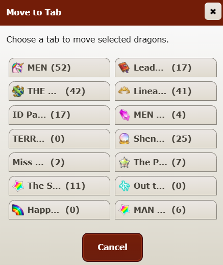
Tab names are still largely cut off/far less readable when I go to move a dragon. I'm on desktop, Chrome browser.
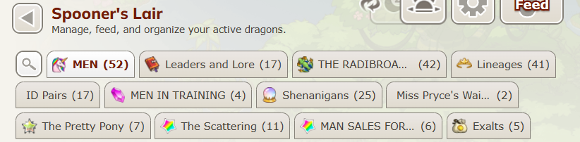
Regular tab display:
What I see when I go to move a dragon (the names have been mostly cut off, leaving me to pick between MEN and MEN)
This was already reported here, but it's still ongoing despite the fixes for other stuff.
[quote name="Fantelle" date="2026-10-15 07:33:41" ]
uhhh not sure if something just changed but something about the "move to den" window seems to have gotten changed like just today causing my tab names to be completely unreadable (because it only seems to allow like 6 characters before cutting out T____T)
-> the tabs in question:
-> which now all look identical:
[/quote]
Ouch!
Mine aren't quite like this, but it's still taking me too long to remember what's what when "Move to Den" is giving me partial tab titles like Lege, Unho, Supe, The 1, G1 S (two of these!), G1 W, etc.
I haven't moved dragons to den in a couple days or I might have noticed sooner.
uhhh not sure if something just changed but something about the "move to den" window seems to have gotten changed like just today causing my tab names to be completely unreadable (because it only seems to allow like 6 characters before cutting out T____T)
-> the tabs in question:
-> which now all look identical:
Ouch!
Mine aren't quite like this, but it's still taking me too long to remember what's what when "Move to Den" is giving me partial tab titles like Lege, Unho, Supe, The 1, G1 S (two of these!), G1 W, etc.
I haven't moved dragons to den in a couple days or I might have noticed sooner.
testing 1 2 3
Is this a signature?
Do I finally have a signature?
:0
Since the reference image was posted I can now say.... Measuring the reference image in ms paint as appeared by default, and just to make sure my method worked correctly, testing the same at different levels of browser zoom also: I am seeing the site at its intended font size; at least the size of forum text (from already existing posts) in default font is, which i used letters from to compare to the 14px reference.
(This makes sense since I don't use any general system or browser scaling options. FYI for anyone reading, at least when it comes to computers, windows likes to look at your screen size and decide what kind of windows UI scale it should default to without indicating it to you. I learned this from a laptop one time with truly gigantic UI that for some reason, windows decided 125% scale was an appropriate default. From various conversations on other websites, I have learned that many people are affected by this and have not realised this.
You can find this on windows 11 by searching for "display"/looking in settings > system > display, then looking at scale & layout, if it's anything other than 100% you will see everything on your computer scaled up, from the taskbar and desktop icons, to all of your computer programmes that can, including your browser and all websites you go to. I'm not sure if it's contributing the system scale problem, just noting it because again, windows sets these defaults without telling you.)
Anyway....This size is too big for me. I am in a pool of accessibility needs that, funnily enough, was met by average web design before some web designers started thinking they should let disabled & sight impaired people use their websites also. That means on several newer websites I have to zoom out/downscale the sites to read them without getting eye strain. (Technically I think my issue more lies in the brain's ability to parse the difference between the vision in each eye due to a physical eye issue, but regardless of the why, the what is eyes hurty if stare at big text, eyes no hurty for small.)
On FR this is a problem since the site wasn't really designed to be scaled up/down, and things get blurry rather than resized when I scale down, which itself causes some strain (albeit less than reading the default font and default scale). As the thinnest font, I find courier new + default scale to be the most readable, even if I have to kind of navigate all of the (unconverted) modals by instinct to prevent strain the moment my brain latches onto words to read. Disregarding non-converted text, it has problems when it's small (like dragon names on lair pages) and the letters blend together.
All of the alternative fonts have a blurriness issue on all text, including the new source sans 3 (i think that's what it's called). Source sans 3 has a good text size for me, it's just the blurriness issue that prevents me from wanting to use it. The blurriness issue affects all text, but especially smaller text (like dragon names on lair tab pages).
For now i'll stick to new courier, since although it does have the blurriness issue, the letters are so thin to begin with that it's a lot less noticeable.
Since the reference image was posted I can now say.... Measuring the reference image in ms paint as appeared by default, and just to make sure my method worked correctly, testing the same at different levels of browser zoom also: I am seeing the site at its intended font size; at least the size of forum text (from already existing posts) in default font is, which i used letters from to compare to the 14px reference.
(This makes sense since I don't use any general system or browser scaling options. FYI for anyone reading, at least when it comes to computers, windows likes to look at your screen size and decide what kind of windows UI scale it should default to without indicating it to you. I learned this from a laptop one time with truly gigantic UI that for some reason, windows decided 125% scale was an appropriate default. From various conversations on other websites, I have learned that many people are affected by this and have not realised this.
You can find this on windows 11 by searching for "display"/looking in settings > system > display, then looking at scale & layout, if it's anything other than 100% you will see everything on your computer scaled up, from the taskbar and desktop icons, to all of your computer programmes that can, including your browser and all websites you go to. I'm not sure if it's contributing the system scale problem, just noting it because again, windows sets these defaults without telling you.)
Anyway....This size is too big for me. I am in a pool of accessibility needs that, funnily enough, was met by average web design before some web designers started thinking they should let disabled & sight impaired people use their websites also. That means on several newer websites I have to zoom out/downscale the sites to read them without getting eye strain. (Technically I think my issue more lies in the brain's ability to parse the difference between the vision in each eye due to a physical eye issue, but regardless of the why, the what is eyes hurty if stare at big text, eyes no hurty for small.)
On FR this is a problem since the site wasn't really designed to be scaled up/down, and things get blurry rather than resized when I scale down, which itself causes some strain (albeit less than reading the default font and default scale). As the thinnest font, I find courier new + default scale to be the most readable, even if I have to kind of navigate all of the (unconverted) modals by instinct to prevent strain the moment my brain latches onto words to read. Disregarding non-converted text, it has problems when it's small (like dragon names on lair pages) and the letters blend together.
All of the alternative fonts have a blurriness issue on all text, including the new source sans 3 (i think that's what it's called). Source sans 3 has a good text size for me, it's just the blurriness issue that prevents me from wanting to use it. The blurriness issue affects all text, but especially smaller text (like dragon names on lair tab pages).
For now i'll stick to new courier, since although it does have the blurriness issue, the letters are so thin to begin with that it's a lot less noticeable.
Last edited on Oct 19, 2026 14:05:41 by ZephyrPulse
[emoji=palette size=1] [b]Theme Update[/b]
Text fields in the [b]Default Theme[/b] have been lightened slightly to provide [b]better background contrast[/b].
This is most noticeable on pages that use filters:
[LIST]
[*] [url=https://www1.flightrising.com/lair/2886]Lair[/url]
[*] [url=https://www1.flightrising.com/hoard/food/1?sort=name_asc]Hoard[/url]
[*] [url=https://www1.flightrising.com/bestiary/2886]Bestiary[/url]
[*] [url=https://www1.flightrising.com/market]Marketplace[/url]
[*] [url=https://www1.flightrising.com/game-database]Game Database[/url]
[/LIST]
[info]Form fields may render differently on some browsers and devices. This is particularly common on mobile devices.
This update does not change text fields that don't use our newer form field styles. Example: [url=https://www1.flightrising.com/scrying/predict]Predict Morphology[/url].
[/info]






 Theme Update
 - Do you want to hear what I said again? Hoot hoot!


