@StratosPhantom - We've updated the text to be more accurate. Thanks!
@Renaiwom - This is an old text bug, but we have now fixed it. Thank you!
@Sar1x - We have not been able to recreate this issue. Please make a bug report including information about your phone and browser. If the "next" button is missing entirely, please include a screenshot showing how the page looks on your phone. Thanks!
~ Flight Rising Engineering Team ~ - Do you want to hear what I said again? Hoot hoot!
Is there an expected timeline for when coli will accept themes?? Not having dark mode is starting to become a disability access issue now that all other pages have that option. I get a migraine every time I try opening it as it's startlingly white after my eyes adjusted to the darker screens.
Is there an expected timeline for when coli will accept themes?? Not having dark mode is starting to become a disability access issue now that all other pages have that option. I get a migraine every time I try opening it as it's startlingly white after my eyes adjusted to the darker screens.
The new Which Way stone layout is really beautiful, well done and thankyou.
The new artwork is so cute and the Other Activities section is a great addition, quite comprehensive - I feel happy for new players!
The new Which Way stone layout is really beautiful, well done and thankyou.
The new artwork is so cute and the Other Activities section is a great addition, quite comprehensive - I feel happy for new players!
I'd still prefer the Waystone to be floating like it used to, so I wouldn't have to scroll down each time I wanted to click on it. Either that or put it closer to the top of the page. It's not a huge inconvenience, but since that's how it worked before, I don't get why it can't work now.
I'd still prefer the Waystone to be floating like it used to, so I wouldn't have to scroll down each time I wanted to click on it. Either that or put it closer to the top of the page. It's not a huge inconvenience, but since that's how it worked before, I don't get why it can't work now.
Additional sections of the Forums have been updated to use a fully responsive layout.
Forum Index Page
Update header buttons to use new standard code
Restore button to manage pinglists
Forum Board Page
Responsive layout
Improved theme support
Improved screen reader support
Switch out PNGs for now SVG icons
Update header buttons to use new standard code
Position mini pagination below forum thread title and author
Allow longer thread names to wrap to a new line
Support long number formatting on reply count
Additional Notes
This update does not alter individual forum thread pages. This will come in a separate update and will require more time due to the complexities involved with formatting player-generated content within a flexible layout.
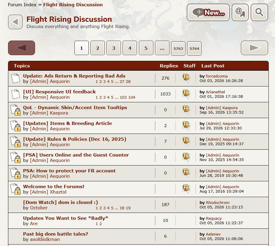
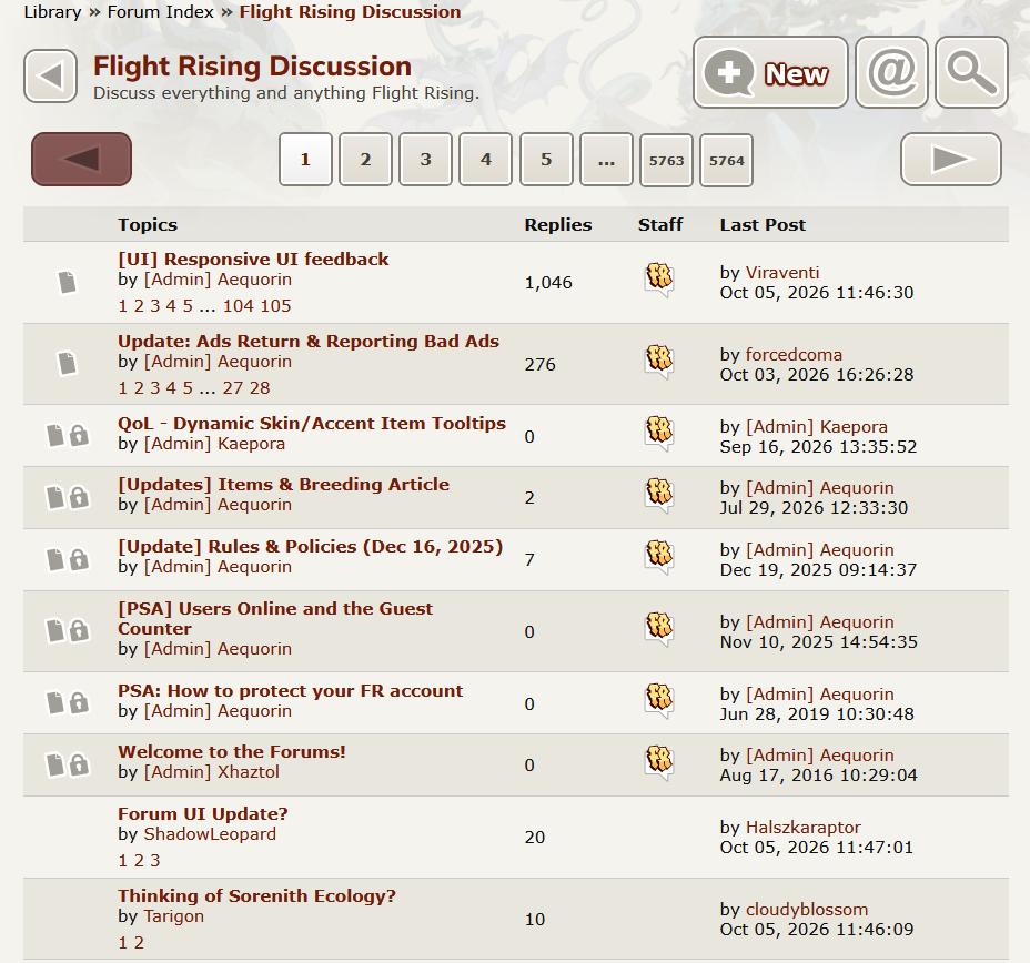
Please put the contrasting color on the icons to indicate a thread is stickied/locked back, I refreshed the page and thought I'd clicked into the wrong forum for a second because of how well the icons blend in now
Please put the contrasting color on the icons to indicate a thread is stickied/locked back, I refreshed the page and thought I'd clicked into the wrong forum for a second because of how well the icons blend in now
Last edited on Oct 05, 2026 11:33:29 by ShiningLatios
Your local aether expert. Seeking a wine/wine/workable tert G1!
whoa, the page numbers are underneath forum titles now...
edit: I have slate theme on override so everything is dark so I didn't realise separators were gone! why is everything white now lol. I think it would be much better to have lines between different threads.
about the page numbers, I don't really think they need to be under the forum titles... it's making it much harder to easily and quickly differentiate/read the titles, which should be the most clear and important piece of text, when browsing.
edit 2: sorry I was on mobile. ignore me. it's fine on desktop!
Last edited on Oct 07, 2026 20:10:35 by cloudyblossom
Moonstone
Minerals & Ores
This radiant gemstone is known for its magical ability to aid in the biological morphing processes of some rare types of sprites and fairies.
Pompom Mums
Plant
This flower's cheerful, crinkly petals shake in the faintest breeze, catching the attention of every bee passing by. (Special thanks to yoshino.)
check out our bestiary quest! please ping, feel free to message! click on me! (^w^)/
.
[quote name="ShiningLatios"]
Please put the contrasting color on the icons to indicate a thread is stickied/locked back, I refreshed the page and thought I'd clicked into the wrong forum for a second because of how well the icons blend in now[/quote]
Please put the contrasting color on the icons to indicate a thread is stickied/locked back, I refreshed the page and thought I'd clicked into the wrong forum for a second because of how well the icons blend in now
Hatchery - Tracking Dragon - Stock the Pond
Can we get the darker linebreaks back as well? everything is blending into each other
vs.
I also would prefer if the spacing was brought back to it's old look :') I'm having a hard time parsing different thread titles, but I'm unsure if it's just because of the poor breaks or not.
The sticky images being wider also leave a lot of blank space on standard threads compared to before
The "block" the forums were in before also helped my eyes know where to start when reading a new line, and I completely gloss over the "topics/replies/staff/latest posts" line at the top now that it's not contrasted at all
he/him || ping for a reply
Double Grapefruit collector :>
please please please change it back. this is a change i actually feel strongly about, please, i cannot really tell what im looking at compared to the old UI, my poor disabled eyes are struggling :((((((((
please please please change it back. this is a change i actually feel strongly about, please, i cannot really tell what im looking at compared to the old UI, my poor disabled eyes are struggling :((((((((


 - Do you want to hear what I said again? Hoot hoot!



 ................
 ................
 ...............
 .............