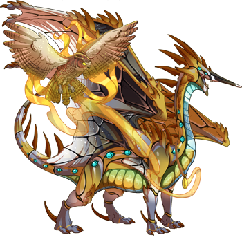
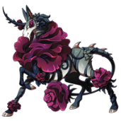
After sitting with this a while and looking at other users' comparison shots of the old and new art... I just can't get on board with this redesign. Honestly, if you showed me the two sets and I had no previous knowledge of the site, I would absolutely think the new version was the older art in need of a revamp. The new art lacks the depth and character of the old art, both quite literally (loss of the metallic look and decreased detail) and more subjectively (the color choices and alteration of certain shapes).
I understand that the artists put in a lot of effort and that the site is moving toward a more unified style, but sometimes it's just not a real improvement.
The updated apparel looks amazing!
The updated apparel looks amazing!
The wings apparel looks so nice! Thanks so much, staff!
The wings apparel looks so nice! Thanks so much, staff!
I know I've commented on this thread before saying I liked the update, and I'm still not too upset with the aesthetics change, but I've had a while to look at the art of the new update and it perplexes me at times.
I cited Otto as looking fantastic with the new update in my last post but then I looked closer and I noticed his back wing.
[url=http://flightrising.com/main.php?dragon=52113834]
[img]http://flightrising.com/rendern/350/521139/52113834_350.png[/img]
[/url]
What's even going on there. I... I do art, and I have trouble flipping stuff like that sometimes too, yeah, but...
It's hard to not notice it now that I've seen it ;_; I hope that gets fixed! (I hope the overlapping of tails it does on, say, imp boys gets fixed as well)
I know I've commented on this thread before saying I liked the update, and I'm still not too upset with the aesthetics change, but I've had a while to look at the art of the new update and it perplexes me at times.
I cited Otto as looking fantastic with the new update in my last post but then I looked closer and I noticed his back wing.

What's even going on there. I... I do art, and I have trouble flipping stuff like that sometimes too, yeah, but...
It's hard to not notice it now that I've seen it ;_; I hope that gets fixed! (I hope the overlapping of tails it does on, say, imp boys gets fixed as well)
i personally don't have much beef with this set redraw, only thing im REAL missing are the accent colors
the beige on white set was especially good, and it's sad to see it gone
of all the old apparel, this didn't seem like the one that urgently needed a redraw
but i appreciate the staffs hard work anyways
It seems clunkier to me. The vest fit seemed bulky on my Coatl F, where it didn't before, so that's come off. The wing blades, well, the coverage is different ,short and pokey, and I don't care for it, esp on my Nocturne girl, sticking out so strangely.
I like that wing blades and wing armor are an option for all dragons, but that's about the only good in this.

If you like them, please Like them!
[center]*me at every update these days*
[img]http://giphygifs.s3.amazonaws.com/media/tFK8urY6XHj2w/giphy.gif[/img][/center]
*me at every update these days*

...Wow the more I look at the clipping on male nocturnes the more I hate it
Even if I do like the new update, still don't think the old art needed updated so suddenly especially when y'all coulda done a poll like you did with the bows since it's such a huge update compared to the flowers. :/
...Wow the more I look at the clipping on male nocturnes the more I hate it
Even if I do like the new update, still don't think the old art needed updated so suddenly especially when y'all coulda done a poll like you did with the bows since it's such a huge update compared to the flowers. :/
I must say, ive been on this site for a few years now, and didnt notice much of a change with the steampunk sets. I personally wasnt a huge fan of the whole look, but i viciously adored the wings and the muted harmony on the dragons i placed them on. However, with the new update, ive noticed the wings have become kind of a strain to the overall look of the dragon. Far too bright and shiny, when the whole idea of steampunk is technology in the olden days, as in cheap and barely held together. I do greatly enjoy the color and design changed made to other steampunk aspect, but felt the wings didnt need to change, at least not the colors. I loved the muddy colors, it was wonderful. Unfortunately now i dont like the look of my dragons that much, but will take it over no apparel at all.
I must say, ive been on this site for a few years now, and didnt notice much of a change with the steampunk sets. I personally wasnt a huge fan of the whole look, but i viciously adored the wings and the muted harmony on the dragons i placed them on. However, with the new update, ive noticed the wings have become kind of a strain to the overall look of the dragon. Far too bright and shiny, when the whole idea of steampunk is technology in the olden days, as in cheap and barely held together. I do greatly enjoy the color and design changed made to other steampunk aspect, but felt the wings didnt need to change, at least not the colors. I loved the muddy colors, it was wonderful. Unfortunately now i dont like the look of my dragons that much, but will take it over no apparel at all.


