So much support. Maybe something sorta like this?
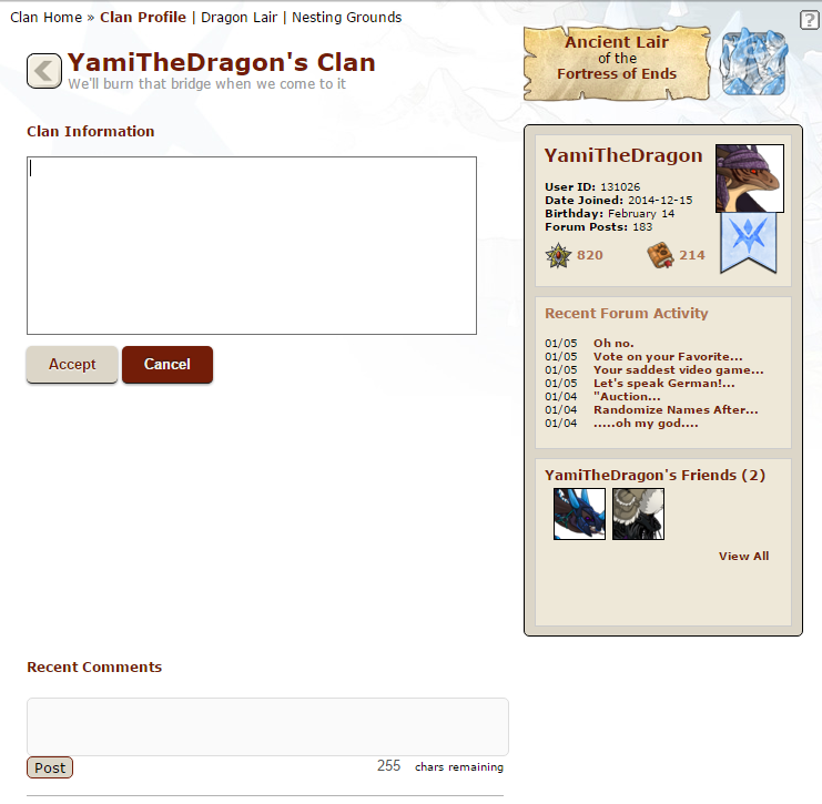
when there's no text:
[img]http://fs5.directupload.net/images/160111/4bjpt8eo.png[/img]
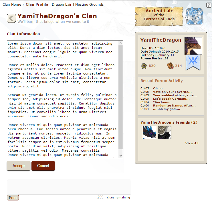
when there's text, the box extends to a certain point, after which it starts scrolling.
[img]http://fs5.directupload.net/images/160111/bxykewhl.png[/img]
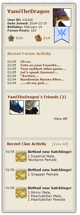
As for Recent Clan Activity, maybe put it under the "Friends" tab?
[img]http://fs5.directupload.net/images/160111/trgtqqxo.png[/img]
Or maybe remove it and just add a "View Clan Activity" link or something. As it stands now the thing feels pretty useless to me personally (might be because it shows me having hatched things about 90% of the time).
[b]Edit:[/b]
[quote name="Latigirl" date=2016-01-11 14:11:56]Or just add the recent activity under/in that box on the right of the page under recent forum activity (logical placement: recent and recent).[/quote]
[url=http://www1.flightrising.com/forums/sug/1710024/2#16823003][ full post ][/url]
[img]http://fs5.directupload.net/images/160112/ct2s9kgm.png[/img]
alternate version (now with friend and message buttons)
So much support. Maybe something sorta like this?
when there's no text:

when there's text, the box extends to a certain point, after which it starts scrolling.

As for Recent Clan Activity, maybe put it under the "Friends" tab?

Or maybe remove it and just add a "View Clan Activity" link or something. As it stands now the thing feels pretty useless to me personally (might be because it shows me having hatched things about 90% of the time).
Edit:
Latigirl wrote on 2016-01-11:
Or just add the recent activity under/in that box on the right of the page under recent forum activity (logical placement: recent and recent).
[ full post ]

alternate version (now with friend and message buttons)
Support, especially for information. that small text box is so frustrating, and also the Recent Clan Activity... its position as it is now makes it seem like it's more important than it really is. When people click on my profile they don't care that I got the Scavenging Level 30 Achievement or that I hatched new dragons recently.
I'd also like - if anyone hasn't mentioned this yet - to be able to remove certain things. For example when editing the page you can choose what displays at what doesn't. Of course, there should be things that can't be removed no matter what like your username, avatar, flight etc. This can help people privatize things they no longer want to be public. I'd like the options to:
-Hide my Friends List
-Hide/Disable my Recent Clan Activity
-Hide my Recent Forum Activity
-Hide my Birthday
-Disable Profile Comments
Yeah, the Recent Activity thing feels like wasted space right now. Maybe if they end up with new site features that get displayed in the feed that will change, but right now it's pretty dull. I would be fine with it just disappearing altogether, honestly.
And I love the idea of being able to change the colors of the profile page. Or even have it be set by your flight, but be more reflective of that flight in some way. As it is, we each have a flight banner across the top, but it doesn't really add much in the way of atmosphere to the profile or lair pages themselves. Maybe if the color scheme, background image, and/or some other visual elements on those pages themselves were changed, that would help the pages feel more like they are actually part of our flights. Sans that, the ability to set our own background images would be nice. I just feel like we have pages with a bunch of empty or useless spaces that feel very generic. The ability to customize them more, or have them feel more incorporated with our flights and lore would be very nice for a better, more immersive experience.
The clan recent activity should just link to a page or something. Honestly all it says most of the time is the buddy comedy thing that everyone ignores, or "they hatched these eggs!" with no info about the eggs anyway. It's unnecessary.
The comment section should be shorter, I do agree.
I also agree that the clan info/bio area should show more. The whole point of the profile page is to see what the person has written about themselves and their clans. If it's not just one clumped area, it could be several individual areas like sections for player bio, clan lore, other information, whatever. But if it's just one huge chunk, then more needs to show of it, imo.
So I agree with expanding the bio section because.. that's kind of what the page is for.
I support this!
There are a few things I'd want to add as well though:
- Make the 'Block User' on other people's profiles an actual button. Right now it is just a weirdly random floating link for some reason and it looks out of place like that despite being in alignment. It is also difficult to see like that because a) it is small and b) it is floating beneath all the important seeming stuff so it is easy to scroll past it by accident and think it is impossible to block people.
- Add a preview button to the bio section (this would also be handy in dragon bios too honestly). I want to be able to check all my links and images are working BEFORE I click save and it currently doesn't let me do that which is inconvenient for testing why it isn't working.
Please.... oh God PLEASE. Make this happen, oh dearest deities of Sornieth... QAQ
Please.... oh God PLEASE. Make this happen, oh dearest deities of Sornieth... QAQ
Support! I purposely made my profile short because I hate having to scroll to see the whole thing!
Support! I purposely made my profile short because I hate having to scroll to see the whole thing!
*sobs* pleeeeaaasseee
i think having it expand like dragon bios do would be ideal. that way if you have a line or two, it's much the same as it is now, but if (like me) you want to fancy that spot up with columns and graphics and lore it will expand.
but not forever, either. i think limiting expansion (before a scrollbar pops up) to about where the recent activity section ends (that section is p boring) now, would be great.
and i'm on board with shortening how many comments are on the page. it's so many right now, and i feel like it's just barren space down there with the comments languishing all alone and sad. maybe spruce that up, or have like a limit. i'd rather have more pages of comments than the 12 that are there (and why 12??? why not 10??). scrolling to about 5 still keeps the ad on the side, and after that it just feels sad XD
SUPPORT. I mostly just want more read space for the profile text. Please.
SUPPORT. I mostly just want more read space for the profile text. Please.
