Back

Announcements & News

The latest announcements and Flight Rising news.
TOPIC | Steampunk Refresh
1 2 ... 48 49 50 51 52 ... 62 63
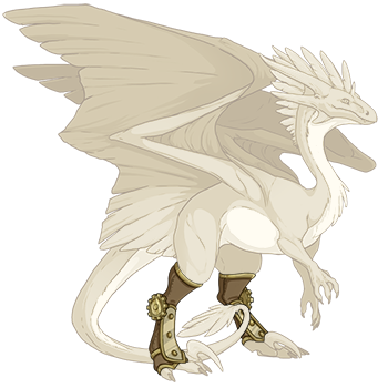
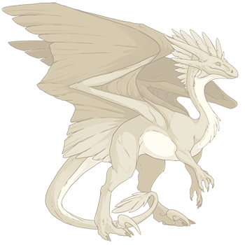
Not sure if this one has been pointed out, sorry if it’s a repeat but look at the tail with/without spats on wildclaw female... [img]http://www1.flightrising.com/dgen/dressing-room/dummy?breed=10&gender=1&skin=0&apparel=391&xt=dressing.png[/img] [img]http://www1.flightrising.com/dgen/dressing-room/dummy?breed=10&gender=1&skin=0&apparel=&xt=dressing.png[/img]
Not sure if this one has been pointed out, sorry if it’s a repeat but look at the tail with/without spats on wildclaw female...
dummy?breed=10&gender=1&skin=0&apparel=391&xt=dressing.png
dummy?breed=10&gender=1&skin=0&apparel=&xt=dressing.png
Ohh, one of my favourite sets, interesting.

Anatomy and other errors aside, assuming they get fixed, it is rather nice, just...different. The wings in particular, they look like a completely new apparel piece or something (maybe that's what they should have been made into, actually—a separate apparel piece in addition to the old ones. XD Their original look will be missed, even though the new one is cool, too). All in all though, not bad!
I'm excited because this update indicates they are working on a new dragon breed. Probably they got to the steampunk set and found all those little details hard to recreate, and the inconsistent design in the wings made it difficult to pick a design, so they simplified it to make it fit the new dragon breed and make it easier to add future dragon breeds.
Y02PS6v.png
[quote name="ElvenArtist" date="2019-09-07 10:14:47" ] Everything else is fine I guess, but I just can't like those wings. The wing blades on the old ones are so much better. It doesn't help that they look completely flat, save for the super shiny gears (which really shouldn't be the focus). I wish we had been polled on this [emoji=coatl sad size=1] [/quote] [i]Edit: I'm glad that many of the errors are going to be addressed! But I'm still frustrated about this redesign and want to get my thoughts out somewhere so it'll be out of my head while I work on assignments throughout the week.[/i] [i]Edit 2: Back again! Just wanted to clarify:[/i] [LIST] [*][i]I do appreciate the artists. I'm an artist myself! But I'm still allowed to be upset over a surprise change to a piece of apparel that's more than minor.[/i] [*][i]Older players can and do like this update. I like most of the pieces! The wings are the only thing I have a problem with. But it's not incorrect to assume that a lot of the art revamping is to draw more users in; that's the whole point of updates, and there's nothing inherently wrong about that.[/i] [*][i]Communication is the other issue I have with this update. I'm not demanding separate sets, I just wish there was more communication or a different route taken for this update.[/i] [*][i]If you disagree with me, please just reach out! I'd love to chat and see the update through different eyes.[/i] [/LIST] [i]I will be retracting and rewording some of my statements to better reflect my views. I apologize if I upset anyone.[/i] I want to elaborate more on my previous statement: I get that we need updates to the art, and I support revamping the site in general! Though I have my own personal gripes with the stylistic direction the site has taken over the past four years (when I joined), consistency and cleaner artwork are necessary to appeal to newer members and keep the site "consistent and modern", as it's been phrased around FRD. But when I hear the term "update", my expectations are that a piece of apparel will be updated (fix errors, clean up lines, adjust colors), [i]not[/i] completely redesigned. The Steampunk apparel, though not widely used, had a unique place. For many of the dragons utilizing steampunk apparel, the rest of their ensemble were curated to match the tones/colors/aesthetic of the steampunk pieces in use. For myself, the old gold steam-wings worked perfectly to add an "armored angel" appearance to my Light rep, while the old brass steam-wings matched the Golem Gauntlet and other lightning-themed apparel my Lightning rep is wearing. I was able to use this set for two entirely different aesthetics due to how subdued and flexible the original design was. Admittedly, these are subjective claims, and don't reflect the views or playstyles of all players. I don't expect FR to cater to [i]me[/i], but I feel that I'm not alone in the dissatisfaction with the changes and the lack of communication prior and it would be wrong to brush those who have problems under the rug. I'm content with the updated steampunk apparel, for the most part. Everything looks like it remained mostly true-to-origin, save for clipping errors and color issues which are presently being addressed. The new wing cover things are a bit clunky and boring but nonetheless inoffensive, and I'm sure they'll get better with the fixes. But the wings? They aren't similar at all, and lose the stylistic charm the old wings had. They don't particularly fit "steampunk" either, as they've lost their dull-and-dirty scrap-metal appearance to shiny gears, blinking blue sci-fi lights, and angular wings. That, along with how flat they look due to lack of texture or shading, just make the new wings a lackluster replacement in my eyes. I just wish they had fixed up the original design and released these new wings in a different set, as the design's interesting and would have fit well in a sci-fi battle gear set! But, even if the wings had to change, I wish there had been more communication prior, similar to how the ribbons were handled. It would also be nice if the definition of "revamp" was more clearly indicated in terms of old apparel, so more people (including myself) know what to expect when the classic sets get a new coat of paint. I'd like to express my appreciation for the staff and artists, though, despite my grievances with this update and some past ones. It's incredibly hard to work under deadlines while also pleasing a large and divided community, and while there have been some decisions made that I don't personally agree with or like, I admire the diligence and persistence that the staff has when dealing with uproars and updates. Thank you [emoji=coatl happy size=1]
ElvenArtist wrote on 2019-09-07 10:14:47:
Everything else is fine I guess, but I just can't like those wings. The wing blades on the old ones are so much better. It doesn't help that they look completely flat, save for the super shiny gears (which really shouldn't be the focus).

I wish we had been polled on this

Edit: I'm glad that many of the errors are going to be addressed! But I'm still frustrated about this redesign and want to get my thoughts out somewhere so it'll be out of my head while I work on assignments throughout the week.

Edit 2: Back again! Just wanted to clarify:
  • I do appreciate the artists. I'm an artist myself! But I'm still allowed to be upset over a surprise change to a piece of apparel that's more than minor.
  • Older players can and do like this update. I like most of the pieces! The wings are the only thing I have a problem with. But it's not incorrect to assume that a lot of the art revamping is to draw more users in; that's the whole point of updates, and there's nothing inherently wrong about that.
  • Communication is the other issue I have with this update. I'm not demanding separate sets, I just wish there was more communication or a different route taken for this update.
  • If you disagree with me, please just reach out! I'd love to chat and see the update through different eyes.
I will be retracting and rewording some of my statements to better reflect my views. I apologize if I upset anyone.

I want to elaborate more on my previous statement:

I get that we need updates to the art, and I support revamping the site in general! Though I have my own personal gripes with the stylistic direction the site has taken over the past four years (when I joined), consistency and cleaner artwork are necessary to appeal to newer members and keep the site "consistent and modern", as it's been phrased around FRD. But when I hear the term "update", my expectations are that a piece of apparel will be updated (fix errors, clean up lines, adjust colors), not completely redesigned.

The Steampunk apparel, though not widely used, had a unique place. For many of the dragons utilizing steampunk apparel, the rest of their ensemble were curated to match the tones/colors/aesthetic of the steampunk pieces in use.

For myself, the old gold steam-wings worked perfectly to add an "armored angel" appearance to my Light rep, while the old brass steam-wings matched the Golem Gauntlet and other lightning-themed apparel my Lightning rep is wearing. I was able to use this set for two entirely different aesthetics due to how subdued and flexible the original design was.

Admittedly, these are subjective claims, and don't reflect the views or playstyles of all players. I don't expect FR to cater to me, but I feel that I'm not alone in the dissatisfaction with the changes and the lack of communication prior and it would be wrong to brush those who have problems under the rug.

I'm content with the updated steampunk apparel, for the most part. Everything looks like it remained mostly true-to-origin, save for clipping errors and color issues which are presently being addressed. The new wing cover things are a bit clunky and boring but nonetheless inoffensive, and I'm sure they'll get better with the fixes. But the wings? They aren't similar at all, and lose the stylistic charm the old wings had. They don't particularly fit "steampunk" either, as they've lost their dull-and-dirty scrap-metal appearance to shiny gears, blinking blue sci-fi lights, and angular wings. That, along with how flat they look due to lack of texture or shading, just make the new wings a lackluster replacement in my eyes.

I just wish they had fixed up the original design and released these new wings in a different set, as the design's interesting and would have fit well in a sci-fi battle gear set! But, even if the wings had to change, I wish there had been more communication prior, similar to how the ribbons were handled. It would also be nice if the definition of "revamp" was more clearly indicated in terms of old apparel, so more people (including myself) know what to expect when the classic sets get a new coat of paint.

I'd like to express my appreciation for the staff and artists, though, despite my grievances with this update and some past ones. It's incredibly hard to work under deadlines while also pleasing a large and divided community, and while there have been some decisions made that I don't personally agree with or like, I admire the diligence and persistence that the staff has when dealing with uproars and updates. Thank you
3 hours ahead of FR time
[center]B-but... The Steampunk apparel didn't need an update though? Ugh, now it looks all big and clunky and the colors are all off... What the heck man? More like a downgrade. [emoji=mirror angry size=1] The new piece doesn't make up for it. Looks like I need to redo some of my dragon's outfits now, lol. Man, the steampunk apparel was my favorite... I know I needed to update Nocturne's look, but this is a cruel way to motivate me. *plays Taps for old Steampunk style*[/center]
B-but... The Steampunk apparel didn't need an update though? Ugh, now it looks all big and clunky and the colors are all off... What the heck man? More like a downgrade. The new piece doesn't make up for it.

Looks like I need to redo some of my dragon's outfits now, lol. Man, the steampunk apparel was my favorite... I know I needed to update Nocturne's look, but this is a cruel way to motivate me.

*plays Taps for old Steampunk style*
sJmKU07.gifa8FvSEr.png9dYW39C.png
FINALLY
FINALLY
always lurking. g1 collector
373.gif401.gif
wait the art errors,,, don't worry it/'' be fixed
always lurking. g1 collector
373.gif401.gif
The extra EXP is back at least.
5M41Txb.png 5u7Rre4.png
the Tin set is so freakin gorgeous [emoji=fae love size=1]
the Tin set is so freakin gorgeous
10302021_banner.png
AAAA!! I've wanted a steampunk redraw for a long time, the designs are cute but the linework was SO inconsistent & out of place D:

Really glad you didn't change the look of them too much tho! Also the new color is delightful, I really like the dull tone you chose for it :D

AAAA!! I've wanted a steampunk redraw for a long time, the designs are cute but the linework was SO inconsistent & out of place D:

Really glad you didn't change the look of them too much tho! Also the new color is delightful, I really like the dull tone you chose for it :D

tumblr_okxejoyVNG1tddvg0o1_540.png

fr blog | art blog | Art Sales
They Pronouns
1 2 ... 48 49 50 51 52 ... 62 63